Kiss vs thump
Friday 30 September 2016
Friday 30 September 2016
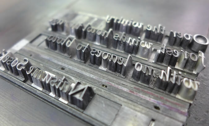
Letterpress printing is arguably the original printing process. In its early days the technique was not very refined. Metal type was not always cast at precisely the same height, the paper was less uniformly even than we think of paper as being today, and the presses were more basic. The result of this being that early letterpress printing featured a considerable indentation where the type had been pressed into the paper. As Eric Gill describes it ‘The printed letter was a coloured letter at the bottom of a ditch’.*
The story of the early development of letterpress printing is essentially the story of the refinement of the process, equipment, and materials involved. Paper, type and presses were all refined and consequently it became possible, indeed desirable, to achieve a much more refined result. Printers demonstrated their skill by insisting upon there being little to no bite into the paper.
Not everyone agreed that this was a good thing, however, as Gill wrote in 1936. ‘A print is properly a dent made by pressing; the history of letterpress printing has been the history of the abolition of that dent’.*
Fast forward to 2016 and the ‘kiss vs thump’ debate is one that divides letterpress printers. Some feel that the mark of good quality letterpress printing is when the type touches the paper so lightly it leaves little more than the ink behind. Others feel that the tactile qualities of letterpress printing are what set it apart and that without them letterpress becomes indistinguishable from litho printing, and thus not worth the additional effort and expense.
Last month Caslon, the owners of the rights to the Adana brand, announced that they were putting their popular 8×5 press back into production 25 years after it ceased. The new model is very similar to the original with one notable difference – the new machines will be reinforced to withstand greater pressure, specifically so that it is possible to achieve the heavier impression that has now become so popular.
This latest development in the story of letterpress printing prompted me to revisit the question of impression, so I caught up with two letterpress printers to ask them for their thoughts.
The traditional printing apprentice learnt from ‘time-served’ letterpress artisans and only became a ‘journeyman’ when he achieved the industry standards. The ‘Printing Office’ was organised in a tier of responsibility. The compositor passed his work to the ‘Reader’ for checking, spelling, grammar, layout and quality of display, only when all aspects were achieved would the ‘forme’ be passed for printing.
A final proof was always taken from the press, checked by the Reader and Foreman. Only after they were satisfied with all aspects of the print quality, could the printing run begin. The negative side of this ‘tradition’ was a strong disincentive to experiment and challenge standard practice.
The new wave of letterpress printers are from a different background and have clients who demand avant-garde designs. The designs are often creative, colourful, exciting and have the hallmark of ‘deep impression’ and texture in the printed image.
As for my opinion? I will not snap off serifs, round the edges of metal characters to gain a deep impression. If you want to impress type, purchase bookbinder brass type and 100% cotton 300gsm paper, dampen before printing to give the ‘authentic deep etch look’!
Nicholas J. Birchall
Cleeve Press
I want to start off by saying that I believe there is no right way to print. Just because something is a tradition spanning hundreds of years does not make it the only way of doing things. All it means is that for hundreds of years the desired aesthetics of printing and the materials used required for a lighter impression.
Historically the paper that was available was of a lighter weight and very expensive, so there was a need to maximize costs and print on both sides. The type used (some of which is still around today) whether lead or wood was soft and fragile. In order to use both sides of the paper effectively, and to preserve the type for as long as possible there needed to be as little impression as possible and thus the ‘kiss’ impression was perfected.
In today’s world we have so many more options of paper and type/plates available to us.
I am not against a ‘kiss’ impression. In fact, I believe if one is going to be printing with lead or wood type, I would implore you to use caution and treat the type with respect. Explain the need to preserve your resources with a client who is looking for that deep impression that modern letterpress is known for.
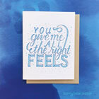
But if your client (or you) want to achieve the modern letterpress result of a nice deep ‘punch’ impression on a thick soft paper stock it can be done. You can go with polymer, magnesium or copper plates, paired with thoughtful packing and get beautiful results with minimal make-ready and locking up. These materials are strong and hold up well under the pressure of the press. They will create those nice crisp deep impressions that show the world that your printed piece was created on an antique letterpress machine.
Most laypeople will have a hard time telling the difference between a ‘kiss’ impression and modern printing. But with the ‘punch’ impression there is simply no mistaking the printing process used to achieve that deep impression. In fact, you can not get these results using a modern printing press. This is what most people are paying for when they want something printed on a letterpress machine.
I print exclusively using polymer plates and I am in love with the feeling of a nice, deep, even impression. Every time I print something new the feeling of running my hand over the impression keeps me coming back to my press over and over again. It feels like magic. I know my customers feel the same way. I can see it when they pick up my cards and run their fingers over them. There is something special about the tactile quality of a deep impression. It helps bring more of the tangible into a world that is increasingly becoming more digital by the day.
Adina Segal
Bunny Bear Press
With a resurgence in the popularity of letterpress printing and a finite supply of Adana machines for Caslon to refurbish the news that new machines will once again be manufactured sounds like good news on all fronts – not only is the demand for these fabulous little machines continuing, but it is outstripping the supply – whichever way you choose to print.
* Eric Gill, An Essay on Typography, Penguin, London, 2013, p.67
![]() Recent posts
Recent posts
![]() Featured posts
Featured posts

Briefing a designer

Eight reasons to use freelance creatives

Putting a freelance designer at the heart of your project

Hello! I’m Sarah, an independent typographic designer, helping businesses to communicate their unique selling points through printed marketing and communications.
I’ve been sharing my knowledge about design, typography, marketing, branding and printing since 2014. I hope you enjoy reading my blog.

Sarah Cowan