Click thumbnails to enlarge
Sign design for Carfraemill
Brief
To design branded roadside signs for Carfraemill that are clear for motorists to read, attract passing custom, and help people who are specifically looking for the venue to recognise and locate it.
Response
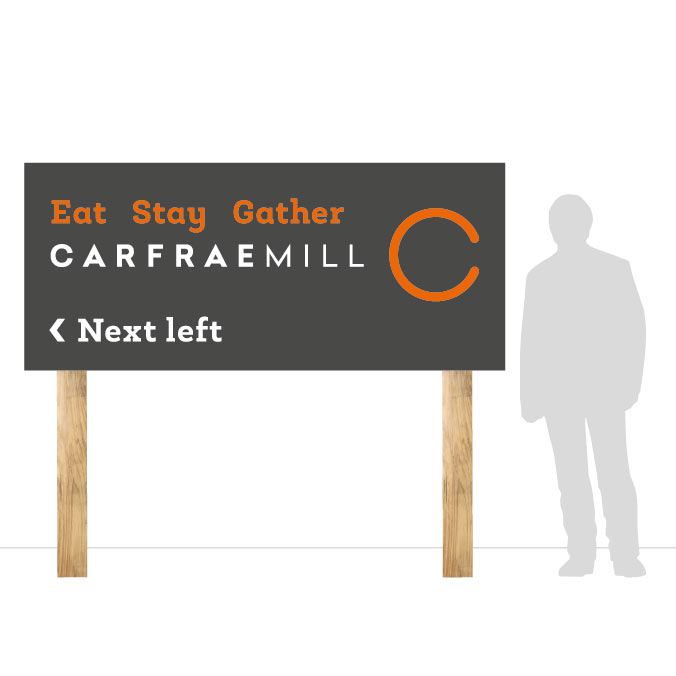
The signs use the same colours and typefaces as Carfraemill’s other marketing materials in order to help achieve brand recognition.
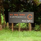
The dark grey background differentiates the signs from other road signs as well as being more practical given the location near main roads and trees. I kept the information very short, and created a simple hierarchy by using white and orange text against the dark background.
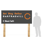
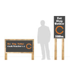
There are three styles of sign – two roadside signs and a smaller sign to mark the venue boundary.
The signs are manufactured using materials that support the brand positioning, but which will stand up to the harsh weather conditions, and come in on budget.