Click thumbnails to enlarge

Data visualization for Pickle Jar Communications
Brief
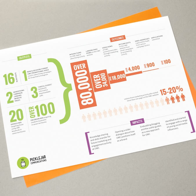
Pickle Jar Communications commissioned me to capture some of the data from their client work in a more visual format that they could use in future project proposals.
Response
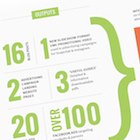
The data covered three distinct areas – outputs, outcomes and inputs. I created visual groupings of these elements using space, distinct presentation methods, and colour. This helped to make sure that the information would remain clear if the graphic was reproduced in black and white.
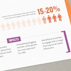
While it wasn’t possible to link any one specific output with a particular outcome it was important to link the sum total of the outputs to the effects measured in the outcomes. To suggest this connection I joined the two sections with an oversized curly bracket which leads into the outcomes. The outcomes data show a funnelling process, which is emphasized by my choice of graphic visualization method.