Clear & effective design for print

Build trust and credibility for your organization with publications that are easier for your target audience to read, understand and act upon – without the headache of navigating the design and print process yourself.

Design services

Two spreads from a brochure I designed for The Gentle Touch Dental Practice

Graphic design

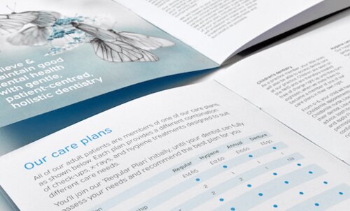
Clear and effective printed brochures, reports and business documents designed to help you sell, explain and interact with your target audience.
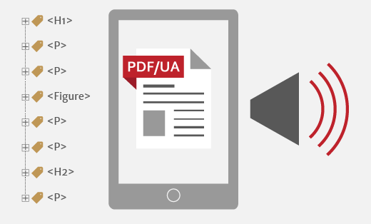
Sample pages from insurance policies I typeset for MB&G insurance

Typesetting

When you already have a design but need a set of text-rich documents creating in the same format.

A blank notebook page surrounded with Pantone and coloured paper swatches

Accessible PDFs

Open up your marketing to the broadest possible audience, with user-friendly design in an accessible PDF format that passes PAC 2024 checks for PDF/UA compliance.

Who I’ve worked for…

Association of Heads of University Administration
Canal & River Trust
Citizens Advice Bureau
The Gentle Touch
Kidney Research UK
MB&G Insurance
Pickle Jar Communications
Police Investigations & Review Commissioner
Police and Crime Commissioner for Norfolk
SAMH
Streets Ahead
United World Colleges
Preparing content for accessible PDF design

Getting started with accessible PDFs

FREE introduction to preparing content for accessible PDF

Join my mailing list for helpful articles about design, typography, marketing and print, and get a FREE copy of Preparing content for accessible PDF design.

Accessible PDFs can feel daunting if you’re accustomed to producing content for printed publications. This brief introduction covers seven key aspects, and has a handy checklist of things your designer will need.

You can unsubscribe at any time. See privacy notice for more information.

Latest design for print articles

Typesetting and accessibility of acronyms and initialisms

Typography

Acronyms & initialisms

All industries have acronyms and initialisms. These are undoubtedly time-saving when communicating with people within your business or industry. But they can make other readers feel ignorant and excluded, disrupt the reading process and cause problems for screen readers.

Different typeface samples overlaid with the question 'the most accessible fonts?'

Typography

The best fonts for accessibility

Accessibility is now a critical issue for organizations. Coupled with a creative campaign from Dyslexia Scotland, this feels like a good time to address the question: which fonts are the most accessible?

'Achieving optimum colour contrast' written with increasing  contrast to the background

Design

Colour contrast for accessibility

Even with an established brand palette, you still have to decide how to use and combine colours. And aside from the implications of colour psychology, brand appropriateness and aesthetic appeal, there is another factor to consider: accessibility.