Acronyms & initialisms
Friday 27 January 2023
Looking at their typography & accessibility
Friday 27 January 2023
Looking at their typography & accessibility
Acronyms and initialisms comprise the initial letters of a sequence of words. However, acronyms are pronounced as words (AWOL, PIN, BOGOF), while we read initialisms as a sequence of letters (BBC, PDQ).
Some acronyms are so widely used and understood that they are now words in their own right – often with their original meaning forgotten. Laser, for example, is an acronym for ‘light amplification by stimulated emission of radiation’.
Except for examples like ‘laser’, which we now recognise as a word, most acronyms and initialisms are typed wholly in capitals.
Frequent strings of full capitals on a page of text can be visually jarring and distracting. It’s a particular problem if the typeface has a delicate appearance or if there is a big difference between the height of the upper- and lowercase letters. To help solve this problem, professional typesetters often use small capitals instead.
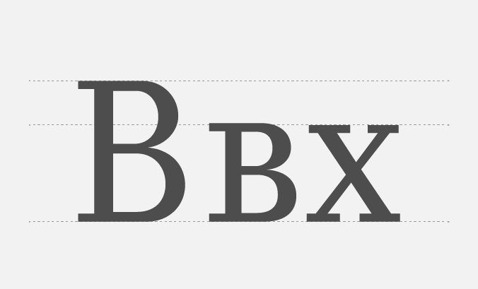
From left to right: full capital ‘B’, small caps ‘B’ and lowercase ‘x’
Small capitals are much closer to the height of lowercase letters, so they harmonise more successfully with a page of text. But small caps are not simply scaled-down versions of full capitals. Their internal shapes and stroke widths are also adjusted to suit their smaller stature.
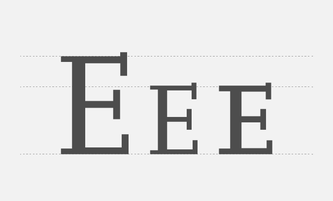
From left to right: full capital ‘E’, scaled down capital ‘E’ and small caps ‘E’. Notice how the small capital ‘E’ is chunkier than the scaled-down version in the centre
Not all typefaces have small caps. And not all software will make accessing them possible or easy. But if you can, using them to typeset acronyms and initialisms can make your document look a lot more polished and professional.
If your typeface doesn’t have small caps, don’t be tempted to use Word’s small-caps shortcut key or reduce the type size to match the lowercase. These methods will reduce the stroke width along with the height, leaving letters which are too lightweight. Instead, try using a type size between half and one point smaller. It will help the capitals to look more harmonious on the page without creating a discernable difference in weight.
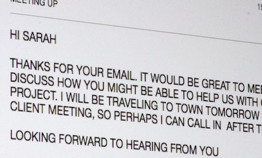
In Britain, we are most accustomed to typing acronyms and initialisms without full stops or spaces between the letters.
However, text set in uppercase often needs adjusting to stop it from looking too tightly spaced. So typographers often add extra space between the letters by applying tracking (subtly spreading out the letters) or by keying additional spaces between them.
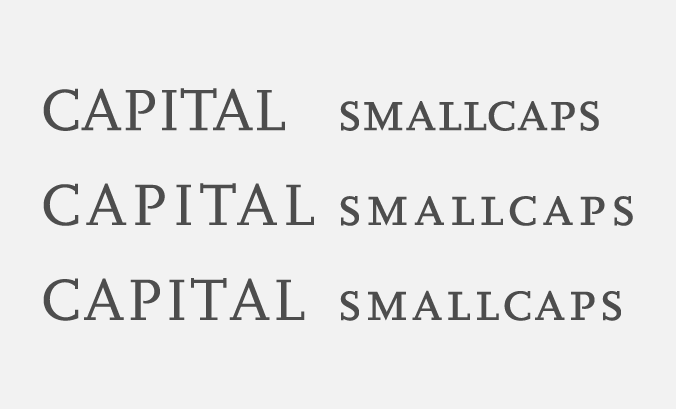
Full capitals and small capitals shown with no spacing at the top, tracking in the middle and hair spaces between the letters at the bottom
Any additional spaces will be much smaller than a standard word space. Depending how much space naturally occurs in the typeface, one of the two smallest spaces available – a thin or hair space – is generally sufficient.
All industries have their own lingo, which often includes large numbers of acronyms and initialisms. These are undoubtedly time-saving when communicating with people within your business or industry. But they can make a general readership feel ignorant and excluded. What do they all mean? Are they pronounced as words or letters?
So the most important thing you can do for accessibility is to ruthlessly remove as many acronyms as possible from all your external communications.
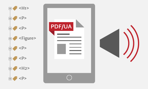
Some screen readers (NVDA is particularly good) recognise many common acronyms and initialisms. Accessible PDFs will need uncommon acronyms to be clarified via expansion text – the full version of the acronym or initialism. Screen readers then allow users to choose if they want to hear the expansion text each time an acronym or initialism occurs. Expansion text is crucial if acronyms or initialisms occur in headings because headings form part of document navigation for users of screen readers.
And finally, don’t forget to tell your designer what each acronym or initialism stands for and how you pronounce it. They will need this information to set up spoken expansion text, where appropriate.
Related posts
Design accessibility standards: design beyond aesthetics
27 May 2022
Using capitals without shouting
26 October 2018
Peppering the page – unnecessary punctuation
29 September 2017
![]() Recent posts
Recent posts
![]() Featured posts
Featured posts

Briefing a designer

Eight reasons to use freelance creatives

Putting a freelance designer at the heart of your project

Hello! I’m Sarah, an independent typographic designer, helping businesses to communicate their unique selling points through printed marketing and communications.
I’ve been sharing my knowledge about design, typography, marketing, branding and printing since 2014. I hope you enjoy reading my blog.

Sarah Cowan