Peppering the page – unnecessary punctuation
Friday 29 September 2017
Using a lot of punctuation can obscure your message, rather than clarifying it.
Friday 29 September 2017
Using a lot of punctuation can obscure your message, rather than clarifying it.
When I receive the copy for a design project the first thing I do is to clean up the text. It could be any number of things – a bit of rogue formatting, additional spaces (between lines or between words), or inconsistencies in the use of capital letters. But one thing that is almost always present is excess punctuation.
A disclaimer at this point – I am not a copywriter, nor an expert in English grammar. What you do with your infinitives is up to you. This blog post looks at punctuation from the perspective of a professional typographer.
As a typographer I am probably more likely to err on the side of creating an aesthetically pleasing result, removing as many unnecessary marks from the page as possible. But I am also extremely keen on clarity of communication. If punctuation is necessary to clarify a message then it stays!
So what do I remove? Some punctuation is just plain wrong. Some might be perfectly at home in a handwritten letter but has no place in a professionally typeset document, and some is just unnecessary.
There are whole books dedicated to the grammatically correct use of punctuation. There are also style guides explaining how to apply it.
I would recommend choosing a style guide and keeping it to hand, or bookmarked on your browser. After all, incorrect/inconsistent punctuation is much like incorrect spelling. It makes you look unprofessional.
The most common errors that I see (and will remove) are things like using a full point after a contraction, rather than an abbreviation. In an abbreviation, the full point indicates missing letters. If there are no missing letters, then no full point is needed. For example, Dr is a contraction of Doctor, so it doesn’t require a full point.
Occasionally I come across people who write just as they speak. This may be entirely appropriate if you are writing a letter to a friend, but in business communications or marketing, it looks unprofessional. This might include overuse of exclamation marks!!! Or leaving your sentences to vaguely trail off…
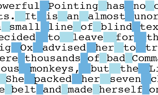
Excessive punctuation peppers the page with dots and dashes that need not be there. It can be very unattractive – as well as distracting. But what counts as excessive?
When copy is typeset it may be broken up into different text blocks, where it is then formatted with different typefaces, sizes, and colours. It is at this point that the unnecessary punctuation becomes evident.
One of the functions of punctuation is to create pauses and groupings in the words that aid reading and comprehension. Much of the formatting that happens during typesetting will reinforce the same pauses and groupings. And this can cause the punctuation to become redundant.
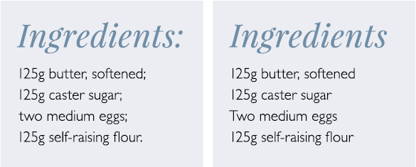
For example, if the text reads ‘Ingredients: 125g butter, softened; 125g caster sugar; two medium eggs; 125g self-raising flour.’ then, perfectly correctly, there is a colon introducing the list, a list of ingredients separated by semicolons with the comma used within one list item, and a full point at the end.
Line breaks, spacing, and differences in type-size and colour can create the same pauses and groupings as punctuation.
But once the same text is laid out on the page of a recipe book, a hierarchy of information is created by the variation in typeface, size, and colour. The line breaks after each of the ingredients indicate a list, and provide the necessary pauses between each list item. This means that we no longer need to use punctuation to do these jobs for us. In other words, the punctuation has become redundant and can be removed. Importantly, removing it doesn’t cause any loss of clarity.
In a business environment, clear and professional presentation is important. This is particularly true than when you’re communicating with customers.
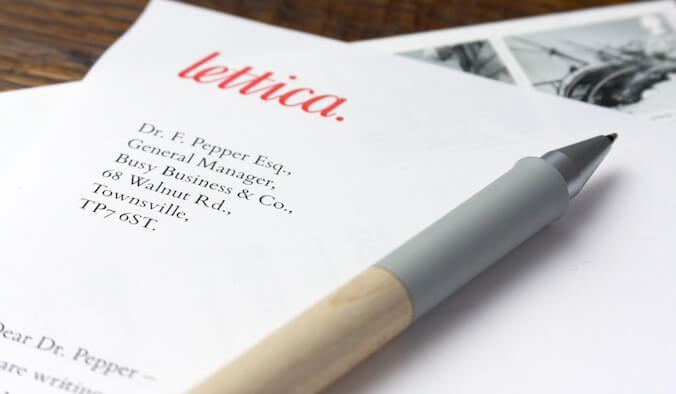
Business letters can easily be improved by making sure there is no unnecessary punctuation in the address, date, or salutation. In the case of the salutation, the body of the letter begins with a capital letter and is separated from the salutation by clear white space. Both things indicate the pause intended between the two elements, and make it unnecessary to include punctuation of any sort.
My top tip – if you’re not sure if punctuation is necessary or not, try removing it and see if the message is still clear.
To chat about how I could help make your materials easier to read, please send me a message.
Related posts
Using capitals without shouting
26 October 2018
Typesetting – the finishing touches
26 February 2016
Seven steps to more professional typesetting
22 May 2015
![]() Recent posts
Recent posts
![]() Featured posts
Featured posts

Briefing a designer

Eight reasons to use freelance creatives

Putting a freelance designer at the heart of your project

Hello! I’m Sarah, an independent typographic designer, helping businesses to communicate their unique selling points through printed marketing and communications.
I’ve been sharing my knowledge about design, typography, marketing, branding and printing since 2014. I hope you enjoy reading my blog.

Sarah Cowan