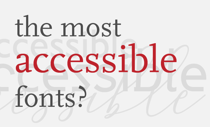
The best fonts for accessibility
Friday 25 November 2022
In short, there is no definitive list of most accessible fonts. But there are some generally-accepted ways to determine how accessible a font is.
Friday 25 November 2022
In short, there is no definitive list of most accessible fonts. But there are some generally-accepted ways to determine how accessible a font is.
In 2016, I wrote about choosing the right typeface for your business or brand, looking at stylistic, technical, practical and financial considerations. For brevity, I omitted any detailed recommendations about typeface accessibility – although typeface choice is at the heart of making written messages easier to read.*
Now, in 2022, accessibility is a critical issue for organizations. Coupled with a creative campaign from Dyslexia Scotland, this feels like a good time to address the question: which fonts are the most accessible?
Let’s start by considering what an accessible font is.
Dalton Maag is a major British typeface design studio. They worked on an ambitious project to develop Reith, the accessible typeface used by the BBC. So the question of what makes a font accessible was key to their process. Here’s what Dalton Maag had to say:
‘We always work on the premise that there are three parts to accessibility: emotional accessibility, how you feel about things; functional accessibility, how this works in terms of a human perspective and legibility and readability.’1
In short, there is no definitive list of the most accessible fonts.
WCAG (the Web Content Accessibility Guidelines) don’t specify a list of accessible fonts, simply requiring content to be ‘perceivable’. There are thousands of fonts out there, with more added every year. So evaluating every single one to create and maintain a list of the most accessible fonts clearly isn’t practical.
Instead, we can assess typefaces based on the visual characteristics that make them easier or harder to read.
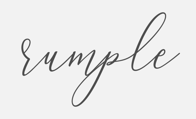
This is Aurelia Script. Does this say sample or rumple?
Choose a font which is easy to read. While display fonts like script fonts may look visually appealing, they tend to be harder to read. They are also more likely to have decorative letterforms or those which differ from what readers might expect – just like the ‘half r’ in the example above.

Compare Gill Sans (left) and PT Serif (right). Gill is infamous for its imposter letter shapes.
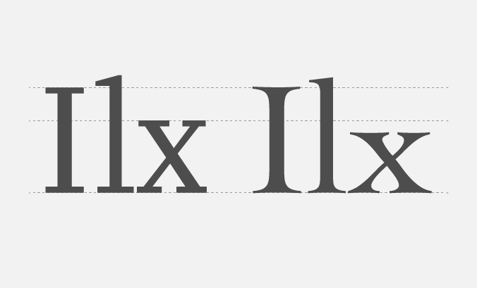
Make sure every letter (and number) in the font looks different. Characters that appear identical can cause problems for everyone in email addresses or URLs but are problematic in any scenario for those with visual impairments or dyslexia. Look out for uppercase I and lowercase ‘l’. And for extra clarity, compare them with ‘1’.
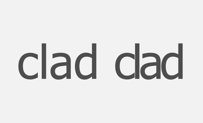
This is Tahoma. On the right I’ve simulated poor spacing to demonstrate the confusion it can cause.
Irregular spacing between letters makes text look shoddy and is a more common problem amongst low-quality typefaces. Over-tight spacing, however, can cause letters to collide. This makes text harder to read and can result in one of those humourous – and sometimes unfortunate – alternate words! Watch out for ‘clad’ appearing as ‘dad’, ‘corn’ reading as ‘com’ or ‘solo’ becoming ‘sob’.
Now you have a short list of essentially legible fonts, move on to looking at more advanced characteristics – some of which can be very subtle.
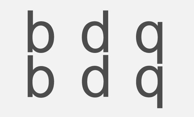
This is Arial. One row reads b, d, q. The other is a b which is first reflected then rotated. Can you tell which is which?
Dyslexia can cause letters to appear to float around, rotate and flip over, with the evident problems this brings for reading. So, while very common, it’s helpful to use typefaces without any rotational symmetry. Pay particular attention to letters p, q, d and b. For example, is ‘b’ a precise reflection of ‘d’? Or a rotated version of ‘q’?
Compare the x-heights of Scala (left) and Cochin (right).
Look at the relative height of the different kinds of letters in your font. The Readability Group recommends that lowercase letters like ‘l’ should be taller than uppercase letters2. And the Association of Registered Graphic Designers recommends using fonts with an x-height of 2/3 to 3/4 of the cap height, although they note that some dyslexic readers find fonts with longer ascenders and descenders to be the most comprehensible3.
Dyslexia is a specific accessibility scenario.
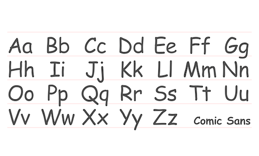
Vincent Connare did not design Comic Sans to be dyslexia friendly. But Dyslexia Scotland maintains that its characteristics mean ‘780 million dyslexic people around the world read better’4.
Designers, on the other hand, have an almost legendary hatred of how Comic Sans looks. It has been the focus of endless jokes and vitriol – and we largely avoid using it. I wrote about Comic Sans being the typeface people love to hate in 2018 and whether this dislike is due to the font itself or the way that it has been used.
Dyslexia Scotland has cleverly tapped into this clash of opinions in their campaign ‘There's Nothing Comic about Dyslexia’. They are lobbying for type designers to create an alternative dyslexia-friendly typeface that the design industry likes enough to use.
So is it possible to have a genuinely inclusive typeface? One which is accessible to all, including those with dyslexia?
Well, Dyslexia Scotland has walked the walk and partnered with type designer, Daniel Brokstad, to create Inconstant, a font they bill as being both dyslexia-friendly and appealing to designers. And the BBC has Reith, an accessible font, tested with users with dyslexia and vision impairment1. I find it interesting that they are so visually different from one another. Watch this fascinating video about Reith to find out more about it.
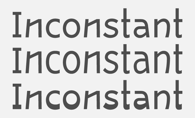
Inconstant designed by Daniel Brokstad. Top to bottom: Regular, Height 100, Base 100.
Inconstant is feature-rich with contextual alternatives, stylistic sets and variable features. While this makes it incredibly flexible, the fully variable version needs up-to-date professional software to work.
Bear in mind that balancing the needs of all users might result in conflicting answers to the question of which typeface is most accessible. Quirks in the design of letters may make them more dyslexia-friendly but they may also make the font harder to read for someone with a visual impairment, confuse a young child learning to read or simply distract another reader from the message the text conveys.
Typefaces substantially impact the look and feel of your marketing materials. So, while changing to a font which is accessible and or dyslexia-friendly may open up your information to a broader audience, it is also likely to change your visual identity substantially.
The good news is that you aren’t limited to a short list of ‘most accessible fonts’. And your materials need not look like a clone of everyone else’s. Look for a font with the right characteristics, and you’ll be well on the way to improving the accessibility of your marketing and communications.
* Even the most accessible typeface can be wholly inaccessible if you use it badly. Typeface choice is not a complete solution to accessible typography.
1 Ability Net, ‘How the BBC designed an accessible typeface’
2 The Readability Group, ‘A guide to understanding what makes a typeface accessible’
3 The Association of Registered Graphic Designers, ‘Accessibility: A practical handbook on Accessible Graphic Design’
4 Dyslexia Scotland, ‘There’s nothing comic about dyslexia’
Related posts
Colour contrast for accessibility
30 September 2022
Comic Sans
25 May 2018
Choosing the right typeface for your business or brand
27 May 2016
![]() Recent posts
Recent posts
![]() Featured posts
Featured posts

Briefing a designer

Eight reasons to use freelance creatives

Putting a freelance designer at the heart of your project

Hello! I’m Sarah, an independent typographic designer, helping businesses to communicate their unique selling points through printed marketing and communications.
I’ve been sharing my knowledge about design, typography, marketing, branding and printing since 2014. I hope you enjoy reading my blog.

Sarah Cowan