Using capitals without shouting
Friday 26 October 2018
Writing everything in capitals makes it look like you’re shouting
Friday 26 October 2018
Writing everything in capitals makes it look like you’re shouting
I am often asked about the correct use of capital letters, and particularly whether they make it look like the writer is shouting, or rude.
Of course, we use capital letters for many purposes when we’re writing. We begin sentences with them, we use them to indicate words like proper nouns, to present acronyms, and sometimes to provide emphasis. You will find a comprehensive guide to how to capitalise words in a style guide such as the Oxford style manual or Hart’s rules.
In professionally typeset or designed documents, however, capital letters also have a range of other uses. For example:
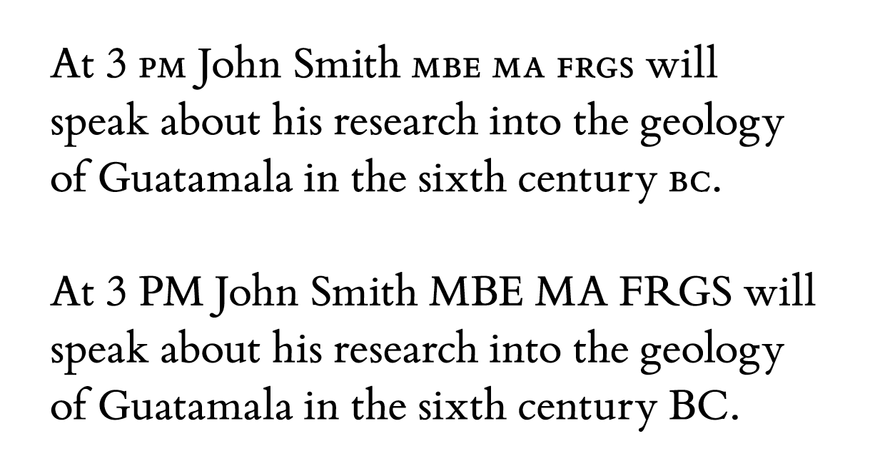
Small caps (shown above) should be used for acronyms in running text
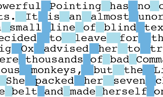
The problem with capitals is potentially three-fold. Firstly, it is worth noting the effect that using capitals has on the way we read. Passages Where Almost All the Words Have Initial Capitals will make us apply emphasis to those words. This can make for a very odd reading experience, and in situations where this used to be considered normal practice (such as newspaper headlines, or multiple-word book titles) it is now regarded as old-fashioned, and unnecessary.
It has also been claimed that using capitals for whole words makes them harder to read. The reason for this is disputed. It could be because the same featureless rectangular shape is created by every word, making them harder to identify. Or it could simply be because we are not accustomed to reading words set in capitals. Whatever the reason, presenting short headlines or phrases in capitals is acceptable, but using them for long passages of text should be approached with care.
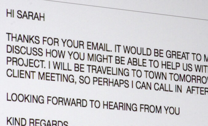
Finally, the exclusive use of capital letters will undoubtedly create the impression that the writer is shouting. In some situations this may be wholly intentional – a poster advertising a new film may well wish to shout about it. In other situations, such as in emails or other personal communication, however, it can cause offence and in such scenarios, the exclusive use of capitals should be avoided.
Capital letters are also known as ‘majuscules’ or ‘uppercase’. Each of these terms comes from a different era in history.
‘Majuscules’ is generally used in relation to handwritten documents, particularly those created by early scribes. When letterpress printing began in the mid-fifteenth century, the term ‘uppercase’ appeared, referring to the placement of the type case containing the uppercase letters above the one containing the ‘lowercase’ letters.
The term ‘capitals’ originates from Rome, where large-scale inscriptions appear on public buildings and monuments. The words, always in capitals, appear high up on friezes, often across the top of rows of tall columns. In the same way, each column has a top section, which may be ornate or plain, but which is also called a ‘capital’.
Related posts
Peppering the page – unnecessary punctuation
29 September 2017
Typesetting – the finishing touches
26 February 2016
Seven steps to more professional typesetting
22 May 2015
![]() Recent posts
Recent posts
![]() Featured posts
Featured posts

Briefing a designer

Eight reasons to use freelance creatives

Putting a freelance designer at the heart of your project

Hello! I’m Sarah, an independent typographic designer, helping businesses to communicate their unique selling points through printed marketing and communications.
I’ve been sharing my knowledge about design, typography, marketing, branding and printing since 2014. I hope you enjoy reading my blog.

Sarah Cowan