Lovely ligatures
Friday 25 October 2019
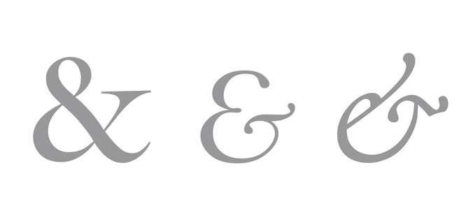
An ampersand is formed of the letters ‘e’ and ‘t’ of the Latin ‘et’, meaning ‘and’
Friday 25 October 2019
An ampersand is formed of the letters ‘e’ and ‘t’ of the Latin ‘et’, meaning ‘and’
Ligatures are two or three letters which are joined together and presented as one glyph. That doesn’t sound all that exciting on the face of it. But, as a typographer, I’m rather keen on them.
The most noticeable ligature, which you are sure to have encountered, is an ampersand (&). This is formed of the letters ‘e’ and ‘t’ of the Latin ‘et’, meaning ‘and’. It is easier to see the origins of the ampersand in typefaces like Bembo and Garamond. There are also ligatures like the Latin ash (Æ) as well as the German eszett (ß). Some typefaces also have a range of other ligatures beyond these examples. These fall broadly into two categories: standard and discretionary.
You are most likely to notice standard ligatures when they aren’t there. That is to say, when reading, the problem ligatures solve is more visually apparent than the solution they present. Allow me to explain.
Some letters have parts which extend into the space occupied by the next letter in the word. A lowercase ‘f’ is one of them. Uppercase ‘T’ is another. This can cause them to either crowd or crash into one another.
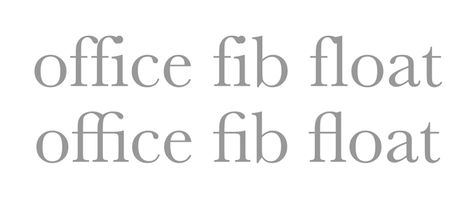
Standard ligatures solve the space problem when lowercase f is followed by an f, i or l
Standard ligatures are the typographer’s solution to this space problem. Instead of allowing extra space between problematic character pairs, which could create unsightly gaps in the middle of words, type designers draw an aesthetically-pleasing combination of troublesome pairings as if they were one letter. The objective is to make the spacing of the letters feel even throughout the word and so, if a ligature is used, you are unlikely to notice it. On the other hand, if the typeface doesn’t have standard ligatures (and not all do), or if they are not used, then you are far more likely to notice something is awry.
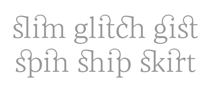
Discretionary ligatures are generally about style, rather than improving readability
Discretionary ligatures are different. They aren’t designed in response to a particular problem; rather they are designed to be noticed. They might take the form of two letters joined by an additional flourish, as in Blacker from Zetafonts, or they might simply overlap the shapes of two or more letters to stylistic effect. Using ligatures like these is generally about style, rather than improving readability.
Of course, type designers produce typefaces for a variety of purposes. In many instances, discretionary ligatures would be inappropriate. So it’s quite unusual to find a typeface which includes such a wide selection as Blacker, for example. However, when they are available they can be a joy.
I’m very much in favour of all ligatures – provided they are used correctly. Correct use of standard ligatures will make text look more polished, as well as making it easier to read. And careful use of discretionary ligatures can add just the right amount of distinctive character and style.
Related posts
Octothorpe – the many lives of one sort
24 November 2017

Cutting a dash
26 August 2016

What is a serif?
31 July 2015
![]() Recent posts
Recent posts
![]() Featured posts
Featured posts

Briefing a designer

Eight reasons to use freelance creatives

Putting a freelance designer at the heart of your project

Hello! I’m Sarah, an independent typographic designer, helping businesses to communicate their unique selling points through printed marketing and communications.
I’ve been sharing my knowledge about design, typography, marketing, branding and printing since 2014. I hope you enjoy reading my blog.

Sarah Cowan