The Reflex Blues
Monday 28 December 2015
Choosing the wrong shade of blue could result in a bad case of the reflex blues
Monday 28 December 2015
Choosing the wrong shade of blue could result in a bad case of the reflex blues
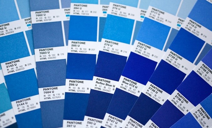
Reflex Blue is one of fourteen mixing inks which are used to make spot colours for printing. For an explanation of spot colours, read my blog post ‘Learning your colours’. If the formula for the colour you have chosen contains a high proportion of Reflex Blue then it could cause problems.
The pigment in Reflex Blue which gives it its colour is called cobalt. Cobalt is a porous mineral, and the particles act like little sponges in the ink – soaking up, and holding on to, the moisture. Consequently inks with large proportions of Reflex Blue take longer to dry. Some printers go so far as to say that they will never actually dry completely.
I spoke to Barry Rushton at Hawthorn Printmakers who told me that modern Reflex Blue is greatly improved in recent years because of advances in technology.
With modern machinery it is now possible to grind pigments into substantially smaller particles of just 5 microns. This creates a larger surface area from the same quantity of pigment, thus strengthening the effect. Consequently less pigment is needed to achieve the same results, meaning there can be a higher proportion of resin in the ink, which contains the pigment more effectively.
Even modern Reflex Blue can cause problems, however. Any ink which is not totally dry will ‘rub off’ onto the sheet next to it. This tends to occur during the finishing processes and will be particularly noticeable if the next sheet is lighter in colour. Even a small amount of rub off can ruin a job if it happens in the wrong place, and it can require the whole project to be reprinted.
Fortunately there are a few ways to minimize or avoid the reflex blues.
Your printer could allow longer for drying in the production schedule, leave the job to dry in shorter stacks, or interleave the sheets with waste paper. However, the best way for printers to minimize the risk of rub off is to use a very quick-drying clear coating across the printed sheet. This can usually be applied during the same pass through the press, and can contain the slower-drying ink beneath it.
Your designer can also help by keeping this issue in mind when designing your project.
If it is essential to use a colour with a lot of Reflex Blue in it – if it is your corporate colour, for example – then it may be preferable to create a design which avoids large areas of solid colour, since smaller concentrations of Reflex Blue will dry better.
Selecting the right paper can also be important. A paper with a matt coating can be quite abrasive, which will exacerbate any rub-off problems.
If you are not tied to a specific blue then you may prefer to select a shade which doesn’t use Reflex Blue at all. The other blue mixing ink is called Blue 072. It is a lightfast pigment which is similar to Reflex Blue, although perhaps slightly brighter and cleaner in colour. It is also made with different pigments which don’t behave in the same way as cobalt.
Related posts
Learning your colours
15 January 2015
![]() Recent posts
Recent posts
![]() Featured posts
Featured posts

Briefing a designer

Eight reasons to use freelance creatives

Putting a freelance designer at the heart of your project

Hello! I’m Sarah, an independent typographic designer, helping businesses to communicate their unique selling points through printed marketing and communications.
I’ve been sharing my knowledge about design, typography, marketing, branding and printing since 2014. I hope you enjoy reading my blog.

Sarah Cowan