Type size demystified
Tuesday 17 February 2015
Why does changing typeface make such a big difference to the apparent size of text?
Tuesday 17 February 2015
Why does changing typeface make such a big difference to the apparent size of text?
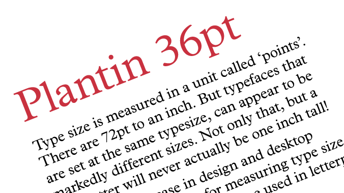
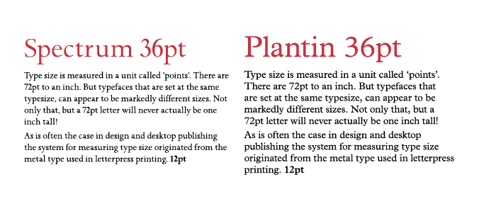
Type size is measured in a unit called ‘points’. There are 72pt to an inch. But typefaces that are set at the same typesize, can appear to be markedly different sizes. Not only that, but a 72pt letter will never actually be one inch tall!
As is often the case in design and desktop publishing the system for measuring type size originated from the metal type used in letterpress printing.
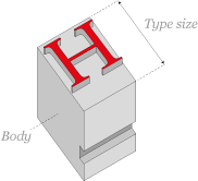
In letterpress printing, each letter is moulded to the top of a metal block, called the body, which holds the letter at the correct height to be printed. It is the top surface of the body that is measured in points to give the type size. So, for 72pt type the body measures 72pt (or one inch).
Since each letter must fit within this space, the size of the body also provides the maximum dimensions for any given letter in that type size.*
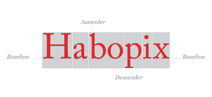
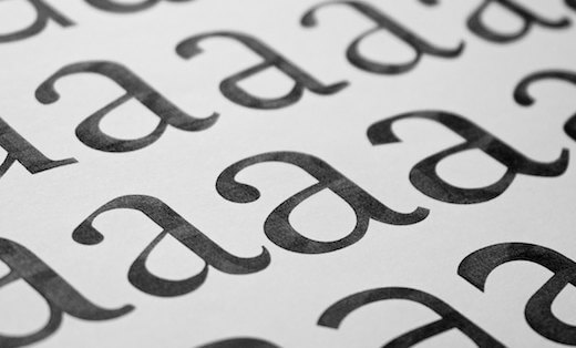
However, each letter cannot simply fill the available space. This is because when the letters are placed next to one another to form words they need to line up neatly at the baseline. Whilst capital letters fit neatly within a confined space they have to be placed within that space in a way that allows them to align with lowercase letters in the alphabet which variously have ascenders and descenders.
It is possible for the letters to be a snug fit within the available space, or for them to be smaller within the same area, creating a visual variation in size. And of course, when type is printed the only thing that is visible is the printed image. There is no indication of the constraining surface area, leaving nothing tangible to be measured.
The digital type used in desktop publishing today no longer has the physical constraint of a metal block onto which the letter must fit, however the system of measurement remains.
The other major factor affecting the visual size of type is the x-height. This is essentially a measurement of the proportion of overall height given to characters without ascenders or descenders, like x, n, o, c, or w, and can vary massively between typefaces. Approximately 95% of Latin text is made up of lowercase characters, so a larger x-height can have a very noticeable effect on the appearance of type size.
* There are a few exceptions, both in letterpress and digital type, where the letter will exceed the area allowed for it. These overhangs are called ‘kern’ since they often occur to allow letters to be set closer together, or kerned.
Related posts
Typeface licensing
29 November 2019
Choosing the right typeface for your business/brand
27 May 2016
Why fonts really do matter
29 April 2016
![]() Recent posts
Recent posts
![]() Featured posts
Featured posts

Briefing a designer

Eight reasons to use freelance creatives

Putting a freelance designer at the heart of your project

Hello! I’m Sarah, an independent typographic designer, helping businesses to communicate their unique selling points through printed marketing and communications.
I’ve been sharing my knowledge about design, typography, marketing, branding and printing since 2014. I hope you enjoy reading my blog.

Sarah Cowan