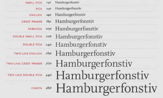
Two line English Egyptian
Friday 23 December 2016
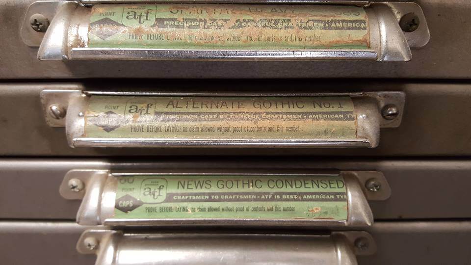
Alternate Gothic No 1. Photograph by Judy Potter Siersema at Letterpress Graphics
Friday 23 December 2016
Alternate Gothic No 1. Photograph by Judy Potter Siersema at Letterpress Graphics
This post follows on from the one I wrote last month about the original method of describing type size using names like minikin, ruby, and diamond – ‘Set in diamond’. This system was eventually replaced by points – the unit of measurement we use for type today – as part of a process of standardisation between foundries, and eventually countries.
The way we describe type size is not the only thing that needed to evolve as the printing industry grew. Another really interesting example of this is the way that type is named.
Today we are used to typefaces being given product names. These originate from any number of sources, eg the printer (Plantin), the designer (Gill Sans), the author of the original document for which the type was used (Bembo, used by Manutius to print Bembo’s book, ‘De Aetna’), a country (Helvetica being a adaptation of Helvetia, the Latin name for Switzerland), or they might be an entirely more whimsical choice.
But typefaces used to be named after little more than their typographic classification or style with perhaps the addition of a modifier such as condensed, or shaded, and eventually with a number to differentiate between designs that fell in the same category.
Rummage around in the type cabinet of a letterpress printer and you could find examples such as Antique Shaded No 2, Egyptian, Ionic, Condensed Grotesque, Tuscan, or Alternate Gothic No 1.
Naming type in this way (while at the same time as using names for sizes) gave rise to names such confusing names as ‘Two line English Egyptian’. This is a perfect example of why this approach to naming type simply wasn’t scalable, and certainly wouldn’t have coped with the thousands of typefaces that we have today.
Two line English Egyptian would have been a sans serif typeface in approximately 28pt. The ‘two line English’ part is the name of the type size. ‘English’ was approximately 14pt, so ‘two line English’ was twice the size.
‘Egyptian’ was the original name for a type style which we would now know as sans serif, or without serifs. An Egyptian typeface might have been designed anywhere in the world, and it wouldn’t necessarily have come from Egypt – or England for that matter!
Interestingly, we still use the name ‘Egyptian’ to refer to a style of typefaces today. Now, however, the term describes typefaces which have large, block-shaped serifs, known as ‘slab serifs’.
Related posts
Set in diamond
25 November 2016
![]() Recent posts
Recent posts
![]() Featured posts
Featured posts

Briefing a designer

Eight reasons to use freelance creatives

Putting a freelance designer at the heart of your project

Hello! I’m Sarah, an independent typographic designer, helping businesses to communicate their unique selling points through printed marketing and communications.
I’ve been sharing my knowledge about design, typography, marketing, branding and printing since 2014. I hope you enjoy reading my blog.

Sarah Cowan