Set in diamond
Friday 25 November 2016
A lot of the typographic terminology we use today comes from the early years of printing.

Friday 25 November 2016
A lot of the typographic terminology we use today comes from the early years of printing.
One of my favourite things about typography is the richness of the nomenclature. Typography is a discipline which arguably began with the invention of printing, circa 1450. Before that point text would have been written by a scribe, or printed using letters carved by hand into a wooden block, and might better be described as ‘calligraphy’ or ‘lettering’. But as Johannes Gutenberg’s use of movable metal type became more widely adopted a new vocabulary was needed to describe the constituent parts of this new ‘black art’.
A lot of the words we still use today come from the early years of printing. However, as the industry grew it became necessary, and perhaps desirable, to develop new ways of describing things. Type size is just one example of this.
Today we expect type size to be described using points. For example, text might be set at 12pt, and a heading at 18pt. Points became a standard size with the advent of desktop publishing – there being 72pts to an inch. This was not always the case however, and the evidence of that is easy to see in the world of letterpress printing.
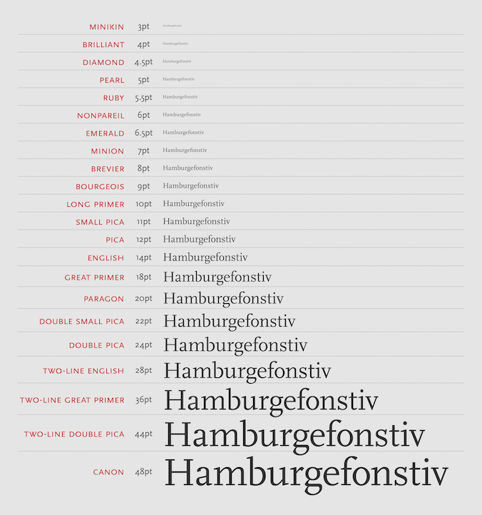
Initially names were used to describe type size. What we know as 12pt type would have been referred to as ‘pica’. Eighteen point headings would have been known as ‘great primer’. These names belong to an era before standardisation, so actual sizes may even have varied between printers and foundries, let alone countries, making them totally unsuitable for the modern age.
The image above shows a list of type size names from England. My favourite here is ‘minikin’, but I also love the use of precious and semi-precious stone names for the smaller sizes. Any text set in diamond is likely to be fairly difficult to read though, so I wouldn’t recommend it! Note the use of multiples, such as ‘two-line’ and ‘double’ for the larger sizes. Conversions between the old names and the points system are approximate.
In 1723 an official decree was issued in Paris, which stated that all foundries must produce their type according to a uniform sizing system. Parisian typefounder Fournier was quick to create such a system, but he based it on a non-standard foot measurement. This was later brought into line with the accepted ‘pied du roi’ measure by Didot, and a point became one twelfth of a ‘cicero’, or 0.38mm. Didot’s system remained in place in France and continental Europe until the 1980s, but was never adopted in Britain or America.
In America a system of type measurement was developed based on the ‘pica’, whereby a point is one twelfth of a pica – making it 0.3515mm. This system also had problems as a pica is not an internationally universal measurement, nevertheless this is the system that Britain adopted.
For many years, therefore, 12pt type from continental Europe was a different size to 12pt type from America and Britain. The differences were slight, but the discrepancy caused difficulties for designers and printers.
It’s worth noting that ‘pica’ still survives in typographic design today and with the same 12pt dimension, although with a slightly different use. Today picas are mostly used by typographers to describe line length or ‘measure’.
Recent posts
Featured posts

Hello! I’m Sarah, an independent typographic designer, helping businesses to communicate their unique selling points through printed marketing and communications.
I’ve been sharing my knowledge about design, typography, marketing, branding and printing since 2014. I hope you enjoy reading my blog.

Sarah Cowan