Saving money with correct colour specifications
Friday 30 August 2019
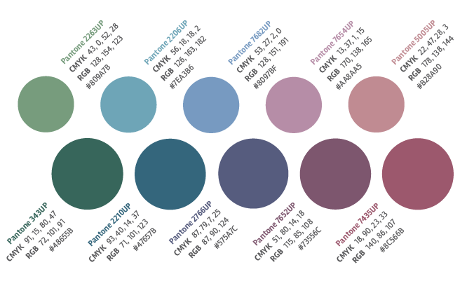
Make sure your identity guidelines have either Pantone or CMYK values for each colour – and ideally both
Friday 30 August 2019
Make sure your identity guidelines have either Pantone or CMYK values for each colour – and ideally both
Are you planning to adopt a ‘web first’ approach to marketing your new business? Or perhaps you are about to have your existing web site overhauled and your branding refreshed? Then pull up a pew, and allow me to save you some money.
I specialise in design for print – I don’t design web sites. So how, I hear you ask, can I help?
When you’re fully absorbed in the complex process of creating a web site it’s easy to lose sight of the bigger picture – how your new branding will work in all the scenarios that might occur in the future. There are a lot of things to consider. But for this post, I want to share just three very simple pieces of advice about colour:
And that’s it. But why is it important?
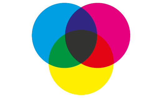
Print uses CMYK, rather than RGB, and the two resulting colour gamuts are not identical. So, unless you never intend to produce anything physical at all,* then each colour needs to be achievable in CMYK. If it isn’t, then you may find you have to pay extra to use a spot colour or foil every time you have something printed.
If you rely upon screen representations of colour then nobody will know how each colour is supposed to look because it will look different on almost every screen. This is one of the reasons why things you choose on the internet often turn out not to be quite the colour you thought they’d be, but it will also make it difficult to evaluate the accuracy of any completed print.
Pantone is the design industry’s answer to describing colour. By simply having a Pantone colour reference you will be able to communicate the colour to designers and printers – and achieve a greater degree of accuracy and valuable consistency across your brand.
In short, no. The minimum requirement would be a set of Pantone references. It’s fair to say that some people will never print a solid PMS (Pantone Matching System) colour, but Pantone swatch books provide the industry-standard colour benchmark, as well as conversions into CMYK, RGB, and Hex. This allows designers to look up everything they need to know about a colour. Of course, not everyone has access to a Pantone swatch book, so it’s helpful if your brand palette has a CMYK breakdown for each colour too.
It’s important to recognise that not all Pantone colours can be matched in CMYK, particularly when printing litho. So it’s a good idea to ask your designer to show you the Pantone swatch. This will allow you to see the CMYK equivalent and, if you plan to use both solid and process versions of the colour, ensure that the CMYK conversion is a good match.
If your palette only shows CMYK values then they may have been calculated by converting the Hex/RGB values used on your website into CMYK. That’s ok, you might think, but has anyone ever seen how this mix of cyan, yellow, magenta, and black ink prints? Probably not. And so, unless you go through a process of colour testing to create your own physical colour references for a CMYK colour, there will be no reliable benchmark for you to match against, and no way to visualise it.
Reliable colour specifications will avoid added costs from any designer who is working on your printed materials in future. It will save them trying to identify the colour you want from an approximation on their screen, or spending time pouring over a Pantone swatch book – either of which could result in potentially expensive news. You will also avoid the need to go through a process of colour testing to create your own custom set of physical colour references.
By making it clear that you want to be able to use your branding in print you could also avoid having to fork out for some of these additional production costs:
* Are you sure you're never going to have business cards? Or product packaging? Or adverts in the press? Or bags? Or staff uniforms, or signage?
If you would like help making your colour palette as cost effective to work with as possible, please feel free to get in touch.
Related posts
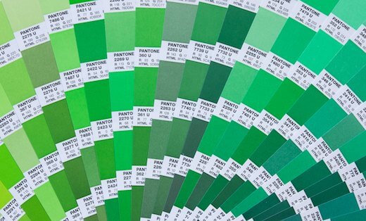
Fifty shades of green (but not the one you want)
24 June 2016
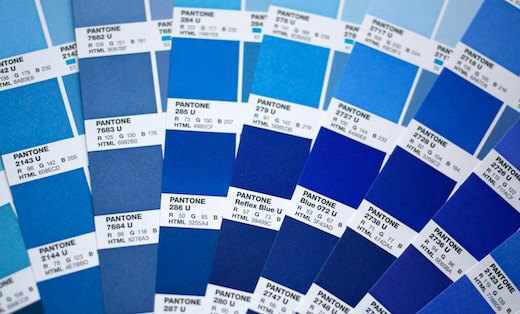
The Reflex Blues
28 December 2015
Learning your colours
15 January 2015
![]() Recent posts
Recent posts
![]() Featured posts
Featured posts

Briefing a designer

Eight reasons to use freelance creatives

Putting a freelance designer at the heart of your project

Hello! I’m Sarah, an independent typographic designer, helping businesses to communicate their unique selling points through printed marketing and communications.
I’ve been sharing my knowledge about design, typography, marketing, branding and printing since 2014. I hope you enjoy reading my blog.

Sarah Cowan