
Cutting a dash
Friday 26 August 2016
The hyphen minus key on a computer keyboard is the tip of a typographic iceberg
Friday 26 August 2016
The hyphen minus key on a computer keyboard is the tip of a typographic iceberg
Since the invention of the typewriter in the 1860s users of these machines, and their descendants the word processor and the computer keyboard, have had just two keys marked with a dash-like character. One of these is an underscore. The other is known in the trade as a hyphen-minus. Tiny as it is, this character is in fact the tip of a typographic iceberg.
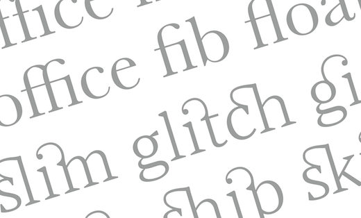
Typefaces today comprise a largely standardised set of characters. The number of spaces in the schema is large, but limited, but depending upon who you ask, and how you count it, there is room for up to twenty-three different sorts of dash in a typeface.*
Some of these variations are simply there to cope with the use of different cases. Some appear to be harder to pin down. The core set of dashes, however, consists of at least three (hyphen, em-dash, and en-dash) and commonly also includes the minus sign.

From left to right: hyphen, em-dash, en-dash, minus sign, and figure dash
This is the symbol that appeared on typewriter keyboards when the original problem of condensing a large character set into a manageable number of keys first arose, and has stayed with us ever since. Professional typographers avoid the use of it, and indeed many word processing programmes now substitute a better choice of dash automatically depending upon the context. To achieve professional-looking typesetting it’s always worth considering whether you are using the correct dash for the purpose. So if you want to choose the right dash, where should you begin?
The hyphen is not properly considered a dash. However, for the sake of this comparison it is the shortest mark in the group. The only proper uses of this symbol are within compound adjectives, or where it is necessary or desirable to split a word at the end of a line in order to create text which is justified, or less ragged.
If you are using hyphenation with justification then it’s important to be aware of the undesirable effect having too many hyphens stacked on top of one another can create.
So called because it is the same width as the size of the type – a variable unit which is known as em. So in 12pt type the em dash will be 12pt long. In 72pt type, 72pt. There are also em spaces which follow the same sizing pattern.
Widely used in the nineteenth century, today em-dashes are more common in America than they are in Britain. They are generally considered to be too long to be used with text faces, although there are exceptions. Phil Bains and Andrew Haslam suggest that em-dashes ‘are more bookish and work better with older typefaces’† in which case they may be used to indicate parenthetical statements used without a space on either side. Similarly Robert Bringhurst recommends their use as a ‘much less fussy’ way to introduce dialogue in place of quotation marks.‡
— Are you going to the beach today? she said.
— Yes, he replied, it’s a lovely day to be beside the sea.
En is another variable typographic unit, which is known as half the type size. In 12pt type the en dash will therefore be 6pt long.
They can be used to form compound words where the two parts are equal, such as the London–Edinburgh line where they would be used without spaces either side, or unspaced. They can be used to indicate a range of time, for example. So October – December. In this instance a space either side of the dash indicates the dash is a substitute for the word ‘to’. When set between a range of figures there is no need to use spaces, eg 18–26 December.
En-dashes are also used – possibly slightly too often by me! – to indicate a parenthetical statement. When used in this way they would have a space on either side.
Again, not properly a dash, this glyph is for mathematical use, and should always be used in place of a hyphen-minus if at all possible, as it is substantially different in spacing and length. If a minus sign is not available then use of an en-dash is preferable.
10−2=8 (minus sign) 10-2=8 (hyphen-minus)
The figure dash is properly used in situations where it appears amongst numbers, in a phone number for example, or in a table of figures. The reason for this is that the length of the dash has been adjusted to complement the standard width of the numerals in the typeface. The vertical position of the dash may also be quite different from the other dashes, sitting rather higher up. Not all typefaces include this dash, in which case an en-dash should be used in preference to a hyphen.
The variety of dashes available can go on to include quotation dashes, three-quarter em dashes, and three-to-em dashes. Although much less commonly included in typeface character sets, these dashes also have their uses for professional typesetting. However, most situations are more than satisfactorily covered by the use of the dashes mentioned above.
* Keith Houston, Shady Characters, Penguin, 2013, p164.
† Phil Baines & Andrew Haslam, Type & Typography, Laurence King Publishing, 2002, p165.
‡ Robert Bringhurst, The Elements of Typographic Style, Hartley & Marks, 1999, p81.
Related posts
Lovely ligatures
25 October 2019
Octothorpe – the many lives of one sort
24 November 2017

What is a serif?
31 July 2015
![]() Recent posts
Recent posts
![]() Featured posts
Featured posts

Briefing a designer

Eight reasons to use freelance creatives

Putting a freelance designer at the heart of your project

Hello! I’m Sarah, an independent typographic designer, helping businesses to communicate their unique selling points through printed marketing and communications.
I’ve been sharing my knowledge about design, typography, marketing, branding and printing since 2014. I hope you enjoy reading my blog.

Sarah Cowan