Click thumbnails to enlarge
Visual identity for Tracy Playle
Brief
To design a logotype for Tracy to use as an umbrella visual identity for all her professional activities. Tracy was looking for something which was professional but playful, energetic, bold, confident, and straightforward.
Response
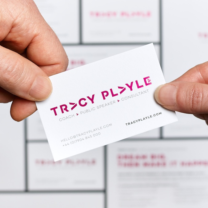
Using uppercase to emphasise confidence, I based the logotype on a simple typeface to keep the resulting design clean and straightforward.
The design uses customised letters and a ‘more than’ created from each uppercase A. This suggests the ‘something extra’ that Tracy brings to a project, but also the added benefits her clients could gain from her coaching or consultancy. The symbol also works alone – as a bullet point, for example.
The postcards and business cards both use a very pale grey board with the logotype in a bold energetic pink. This is foiled on the business cards to add an extra visual and tactile element.