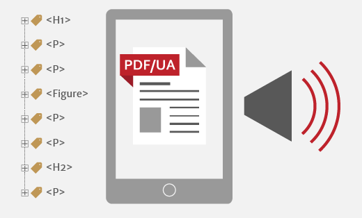
Latest blog post
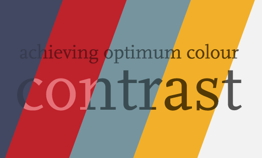
Accessible colour contrast for text
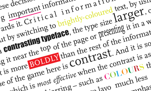
We publish content to communicate a message. But your audience will not receive your message if they cannot read it. This blog post looks specifically at colour contrast for text, including some examples I’ve spotted ‘in the wild’ as a fun quiz!