Printing green
Friday 27 April 2018
Friday 27 April 2018
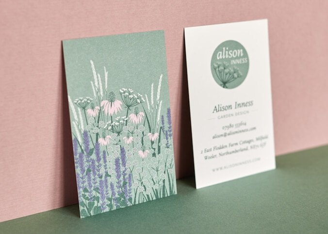
Green is one of those colours that just doesn’t print well. But when creating branding for the garden designer, Alison Inness, whose particular speciality is plant selection and care, it was almost impossible to avoid using green as a brand colour. Alison was particularly keen to use a glaucous green, similar to a Hosta, as a central brand colour, so it was important to make sure that it reproduced well on her business stationery.
Many printers will use lithographic printing for letterheads – even for small quantities. This is because lithographic inks offer a failsafe way to ensure that the resulting product will run through any desktop printer without the ink offsetting. However, the same cannot be said about business cards, which will often be printed digitally, even as part of the same job. The problem with this is that the print quality, and importantly colour, will not match between the two pieces. And if you are printing a difficult colour like green, then the risk of a mismatch is greater.
First of all, choose a shade of green for your branding which converts well to CMYK. Many shades of green are outside the colour gamut achievable by four-colour process printing. For more information on this see my blog post ‘Fifty shades of green (but not the one you want)’. If you specify a colour which is outside the gamut for printing process CMYK then you won’t be able to achieve it without using a spot colour. Conversely, digital printing is more likely to achieve a colour closer to the spot colour, but that might throw up more mismatching problems!
Try to print everything the same way. If you have an inkjet printer or a new laser printer, then you may find the operating temperatures are low enough for you to be able to overprint something which has been digitally printed without the ink/toner transferring off the page. If a design uses a lot of ink, or you have an older laser printer which runs hotter, then you will be better off finding someone who will print everything litho for you.
For the ultimate in colour accuracy specify your green as a spot colour. This will then be printed with an ink which has been premixed before printing, ensuring the right colour is achieved. If you have a full-colour design plus a spot green then this will add to the cost. But if the spot green is one of up to four colours then the cost should be roughly comparable to using CMYK. The additional cost to mix the ink is offset by the saving you make on make-ready time – running the job on press whilst adjusting the ink balance to reach the correct shade.
Alison’s letterhead and business card are printed lithographically. Just four colours are used in her suite of stationery, but each of them is a spot colour. This means that it’s possible to achieve the benefit of the colour accuracy and vibrancy of using spot colours, without a massive increase in cost.
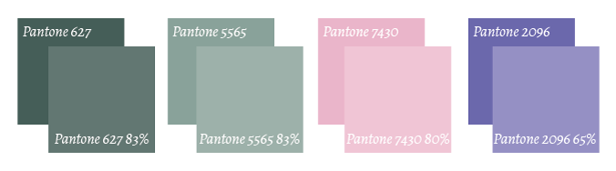
By using tints, four spot colours can make eight colours.
In order to specify the design and illustration in just four colours I used each colour with a tint. This is laid down at the same time as the solid areas, using the same printing plate, so there is no additional cost, but the effect is to create a lighter shade of the colour. This can make four colours look like eight.
For this design, the four colours are two shades of green, one pink, and one purple. The reason for using two shades of green is so that each one could be tinted down to eighty-three percent to create a lighter shade, without the need to tint down further. Tints below about sixty percent will begin to break up, with their screen pattern becoming apparent. This solution also meant that the green background to the illustration could be printed as a full solid.
The advice and guidance of an experienced printer are invaluable in achieving these sorts of subtleties in the specification, but they can make all the difference to the end result. For this project, my thanks go to Andrew at Printing Source whose knowledge, experience, and patience were invaluable.
Related posts
Fifty shades of green (but not the one you want)
24 June 2016
![]() Recent posts
Recent posts
![]() Featured posts
Featured posts

Briefing a designer

Eight reasons to use freelance creatives

Putting a freelance designer at the heart of your project

Hello! I’m Sarah, an independent typographic designer, helping businesses to communicate their unique selling points through printed marketing and communications.
I’ve been sharing my knowledge about design, typography, marketing, branding and printing since 2014. I hope you enjoy reading my blog.

Sarah Cowan