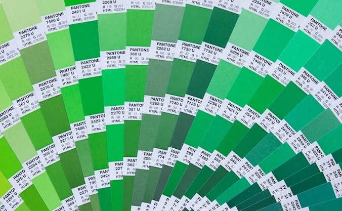
Back in January 2015 I wrote a blog post about CMYK and PMS colour specifications (opens in a new tab). These are the two ways that colour is specified in the printing industries. One of the important things for business owners to know about these colour specification systems is that some PMS colours simply cannot be translated to CMYK. In other words, if you’re printing in CMYK they just don’t exist.
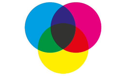
Most commercial printing is CMYK or ‘four colour’. Cyan (C), Magenta (M), Yellow (Y), and Black or Key (K) inks are applied one at a time in varying proportions to build colours up on the press. In combination these four colours can create a huge range of colours (also known as a ‘gamut’). However, PMS colours are created from up to eighteen different ink and this massively increases the gamut of colours it is possible to achieve.
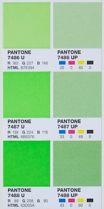
One of the attractions of the PMS colours are the really vibrant shades of colours like green and orange which might look tempting as eye-catching colours for your brand. However, if you attempt to recreate these colours using CMYK print the results can be disappointing, varying from being duller to being a totally different colour altogether.
In the image the PMS colour is shown on the left with the closest CMYK match available on the right.
Why does that matter?
If you (or your designer) select a colour for your branding which only exists as a PMS colour then you will only be able to print it in that way. PMS colours are usually added as an extra, or fifth colour. Very broadly this means that using PMS colours will make your materials more expensive to print – although there are exceptions to this.
What’s the solution?
If you have your heart set on that vibrant zingy green, then there are some possible solutions to investigate.
The easiest and most reliable solution is simply to pay the extra money and have your green printed as a ‘special’ or fifth colour. But what if you are budget sensitive?
Digital printing may offer a potential solution to the problem. Depending upon the press and the way the colour is specified it is possible to create brighter colours with CMYK on a digital press than with traditional litho printing. However, brighter doesn’t always mean more accurate, so carrying out a colour test on your preferred paper is still a good idea before going to production.
Another way to reduce the additional cost of the special colour would be to use it in place of one of the other four colours on press. For business stationery, such as letterheads and business cards, this is quite common practice. If you use your green with just black ink then your job is only two colour, and should in fact be more cost effective to print than four colour would be.
When it comes to more complex designs where you need to have full colour print as well as that green, Pantone (colour gurus across many manufacturing industries) may just have a solution.
The Pantone web site (opens in a new tab) explains a different concept in colour specification – Extended Colour Gamut process colours. As the name suggests, these colours have a larger gamut, or colour range, than CMYK, but instead of achieving this by the use of pre-mixed inks made from eighteen shades, they have produced specifications for colours made up of seven process colours. Essentially, instead of CMYK, this is CMYKOGV – adding Orange, Green, and Violet to the mix.
The aim of the ECG technique is to allow printers to reproduce around 90 percent of those vibrant PMS colours. But many printing presses are built with just four towers to suit the four-colour system, so could this seven colour system really be more cost effective than adding one special colour?
Watch this space!
Related posts
 Recent posts
- Accessible PDF heading structure and the problem of phantom headings
- Accessible colour contrast for text
- How we can work together on accessible PDFs
- Acronyms & initialisms
- The best fonts for accessibility
Featured posts
Briefing a designer
Eight reasons to use freelance creatives
Putting a freelance designer at the heart of your project

Hello! I’m Sarah, an independent typographic designer.
I’ve been sharing my knowledge about design, typography, marketing, branding and printing since 2014. I hope you enjoy reading my blog.

Sarah Cowan