There are two commonly-used systems for specifying colour in the design and printing industries – CMYK and PMS. You will probably hear your designer or printer refer to these colour specifications, but what do they mean?
CYMK
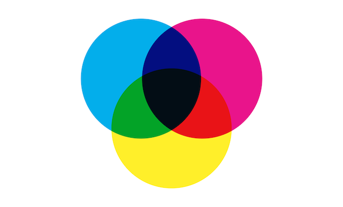
With CMYK, colours are made from unique combinations of cyan, magenta, yellow and key (black) inks. The three primary ink colours (cyan, magenta and yellow) are transparent, allowing them to be applied on top of one another to create secondary colours.

During printing, the four inks are overlaid in sequence in a technique called ‘four-colour process’. Each colour is added in a unique pattern of very fine dots known as a screen. The eye optically ‘mixes’ these dots of varying colour, creating the appearance of a range of colours. But if you look at a printed image through a magnifying glass, you will still see them.

PMS
You can create an impressive range of colours by combining cyan, magenta, yellow and black. However, accurately specifying the appearance of the final colour can be difficult. And there are some colours – like orange – that are very hard to make this way.
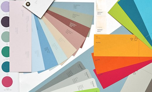
In 1963 Lawrence Herbert helped solve these problems with a new system called the Pantone Matching System (PMS). A book of standardized colours – that both printers and clients can refer to – gives each colour a unique reference number. This made it easier to communicate precise colours. But Pantone also introduced a new way of printing colours.
In the Pantone Matching System, there are formulas for achieving colours from CMYK. But there are also formulas for pre-mixing colours from a broader set of 14 mixing inks. It is these pre-mixed inks that designers are generally referring to when they say PMS colours.
Pre-mixed inks are printed in one go – rather than building up the colours from a series of different coloured dots on press. For this reason, they are also known as ‘solid’ or ‘spot’ colours.
Spot colours also provide other benefits: an increased intensity of colour, assured accuracy of colour, and the ability to print some shades which CMYK cannot.
What does this mean for me?
Today Pantone (opens in a new tab) offers designers and printers a range of 1,677 solid (or PMS) colours, and formulas for mixing 2,868 colours. Designers usually specify either ready-mixed PMS colours or the closest equivalent using CMYK printing.
CMYK colours use four separate printing plates to build up the final colours. But if a design uses a very limited (fewer than four) colour palette, this can be more expensive than necessary. When this happens, it may be preferrable use solid/spot colours since each colour needs just one plate.
It is possible to combine CMYK with PMS in one job, printing CMYK plus a spot colour. However, this can become expensive as each spot colour adds an additional plate. Some printing presses can handle more than four colours, but others cannot, instead requiring an expensive and time-consuming second pass through the press.
To help you get the best value for money and avoid unexpected costs later on, it’s well worth understanding the implications of any colour choices early on in the design process.
 Recent posts
- Accessible PDF heading structure and the problem of phantom headings
- Accessible colour contrast for text
- How we can work together on accessible PDFs
- Acronyms & initialisms
- The best fonts for accessibility
Featured posts
Eight reasons to use freelance creatives
Putting a freelance designer at the heart of your project

Hello! I’m Sarah, an independent typographic designer.
I’ve been sharing my knowledge about design, typography, marketing, branding and printing since 2014. I hope you enjoy reading my blog.

Sarah Cowan