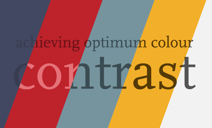
Colour contrast for accessibility
Friday 30 September 2022
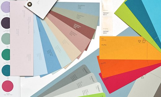
Even if you have an established brand palette, you still have to decide how you’ll use and combine colours.
Friday 30 September 2022
Even if you have an established brand palette, you still have to decide how you’ll use and combine colours.
Even if you have an established brand palette, you still have to decide how you’ll use and combine colours. And, aside from the implications of colour psychology, brand appropriateness and aesthetic appeal, there is another factor to consider: accessibility.
When it comes to choosing colours for text, accessibility essentially means readability. And readability is important, whatever medium you’re using. Using colour in an accessible way helps your audience to read what you have written – whether you’re publishing a printed brochure or a graphic for Instagram.
There is no widely-available guidance on optimum contrast in printed media. And organisations often use the same artwork for outputting both print and PDF formats. So, even though the Web Accessibility Content Guidelines (WCAG) 2.0 are intended for websites, the contrast ratios they recommend are helpful in other contexts.
Success Criterion 1.4.3 of WCAG 2.0 is ‘Contrast (minimum)’. This criterion intends to ensure ‘enough contrast between text and its background so that it can be read by people with moderately low vision’.
But what does that mean?
Firstly, ‘moderately low vision’ might be a long-term condition or a product of a temporary set of circumstances – low light, for example. In other words, it could affect anyone – not just those with visual impairments.
WCAG categorise text by size: ‘normal’ and ‘large’. Each has a different optimum contrast to make it easiest to read:
The visual size of text varies depending on the typeface you use. You can read more about this in my article ‘Type Size Demystified’. For this reason, I recommend paying particular attention to any text set in 12–16pt – either side of the 14pt cut-off.
Colour blindness should be a key consideration when choosing colours, particularly if you want to use colour to provide additional information, eg venues marked in red are closed; those marked in green are open.
However, unless you are colour blind, hue and saturation are not deemed to affect the legibility of text*. Consequently, WCAG explicitly excludes colour blindness as a factor in determining contrast.
For more information on colour blindness and to simulate a colour-blind person’s perception of your colour palette, visit David Nichols’ colourblindness simulator.
Fortunately, it is easy to assess contrast digitally before pressing print or publish. There are lots of online tools you can use to do this. I’ve given an overview of my two favourites below. They are free, easy to use, helpful in different scenarios and complement each other well.
A great tool if you need to check multiple colour combinations simultaneously. You can quickly test all the possible colour combinations in your brand colour palette to see which ones meet minimum contrast requirements.
Each combination displays a label with the highest standard it passes. AAA compliance for normal-sized text, AA compliance for normal-sized text, AA18 compliance for large text or DNP (Does Not Pass).
A series of controls allow you to show/hide based on compliance level, making it easier to see possible colour combinations for headings, for example.
Try out Contrast Grid.
If you want to check a single colour combination – perhaps to improve a low-contrast colour combination identified by Contrast Grid – then Colour Contrast Checker is excellent.
As with Contrast Grid, this tool includes the four WCAG pass/fail criteria. But rather than scoring multiple colour combinations simultaneously, this tool compares just two colours – a background colour and a foreground (text) colour.
This tool is great because it:
Try out Colour Contrast Checker.
* Knoblauch K, Arditi A, Szlyk J. Effects of chromatic and luminance contrast on reading. Journal of the Optical Society of America. a, Optics and Image Science. 8: 428-39. PMID 2007918 DOI: 10.1364/Josaa.8.000428
Related posts
Design for communication: design beyond aesthetics
25 February 2022
Design theories: design beyond aesthetics
28 January 2022
Design beyond aesthetics
26 November 2021
 Recent posts
Featured posts
Briefing a designer
Eight reasons to use freelance creatives
Putting a freelance designer at the heart of your project

Hello! I’m Sarah, an independent typographic designer, helping businesses to communicate their unique selling points through printed marketing and communications.
I’ve been sharing my knowledge about design, typography, marketing, branding and printing since 2014. I hope you enjoy reading my blog.

Sarah Cowan