Design for communication: design beyond aesthetics
Friday 25 February 2022
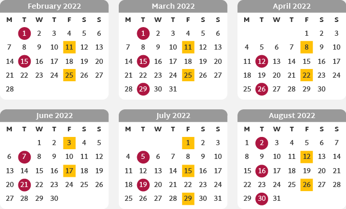
If we use colours to indicate bin collections on a calendar, then the colours must be accessible.
Friday 25 February 2022
If we use colours to indicate bin collections on a calendar, then the colours must be accessible.
This is the latest article in my series looking at some of the myriad reasons why design’s function is to support the successful communication of a specific message to a specified audience, rather than simply ‘making things look pretty’.
Last month I touched on four of the Gestalt Principles of Perception. These psychological principles demonstrate the inextricable link between how information is positioned and presented and how we perceive it. They are just one reason why basing design decisions purely on aesthetics risks a conflict between the actual and perceived messages. Or the design equivalent of saying ‘no’ while nodding your head.
Understanding how our brains are wired helps us to communicate messages successfully. But it isn’t something we can control. So, in this article I’m looking at something we can – design decisions that can support successful communication.
The typeface, type size, colour, case, line length and text alignment all affect the effectiveness of a design – how successfully it supports the communication of the message to the intended audience.
Almost everyone will struggle to read text with a very long line length. And, if you are used to reading from left to right, other alignments are also likely to have a negative impact – as are long segments of text set wholly in uppercase. These are topics I have covered on my blog before.
Beyond this, the reason often lies with the ‘audience’ part of the equation. There are almost endless combinations of end-user demographic, viewing environment and medium. But it is a minute proportion of those scenarios where small text, set in capitals against a background of a very similar or directly opposite colour, will perform well.
My conclusion here is this: if the information is important enough to be published, it is important enough to be presented in a way that end-users can read.
Accessible design goes one step further. It aims to make information accessible to all users – whoever they are – including those with additional visual or cognitive needs. To do this, designers need to consider elements such as colour, contrast, type size and text spacing against specific standards. Let’s take colour as an example.
If we use colours to indicate bin collections on a calendar – recycling in one colour, general waste in another – then the colours must be accessible. They need to be sufficiently distinguishable (for readers with colour-blindness) and different to the background (for readers with low vision). Incorporating some redundancy (another way to differentiate the two types of bin collection) would support readers with limited ability to see the colours (older readers, or those using a monochrome display or black and white home printer). And the colours should be consistently applied, rather than appearing again with a different meaning elsewhere in the document.
Considering colour in this way, rather than as a purely aesthetic element, undoubtedly makes information easier to process. And it is often the case that designing with accessibility in mind provides a better experience for all end-users.
Occasionally we know exactly who the end-user will be, allowing us to consider their unique barriers to accessing information and, consequently, maximise the effectiveness of the design. Dr Rachel Warner has recently completed research into one such specific scenario and very kindly agreed to round off this article with an insight into how design impacts the way we make one particular important life decision.
‘My research was about the way document designers, who might be trained designers or have no training at all, develop documents to help us make decisions about where we might want to live in later life. Decisions about the way information – both text and images – is formatted could make a difference between someone feeling “information overload” or feeling that they have the right kind of information to start a conversation with family members.’
‘The research focussed on design practice – the many actions, decisions, and priorities – designers are balancing when making design decisions. These range from involving users in evaluating document design, to managing limited budgets, as well as deciding on appropriate formatting of text and image for the context of use (including the use of design principles Sarah mentions above).’
‘Observations were also made about how the way documents are designed could contribute towards people being able to identify information appropriate for their life situation. For example, using “visual differentiation” – in this case making different kinds of documents visually different from each other – could help people see through the volume of information available and identify appropriate kinds of information that would be most helpful for them. Another example is the way text and images could be formatted to help people reflect on what is important to them about home and consequently, use this reflection to help make decisions.’
Related posts
Design accessibility standards: design beyond aesthetics
27 May 2022
Design theories: design beyond aesthetics
28 January 2022
Design beyond aesthetics
26 November 2021
![]() Recent posts
Recent posts
![]() Featured posts
Featured posts

Briefing a designer

Eight reasons to use freelance creatives

Putting a freelance designer at the heart of your project

Hello! I’m Sarah, an independent typographic designer, helping businesses to communicate their unique selling points through printed marketing and communications.
I’ve been sharing my knowledge about design, typography, marketing, branding and printing since 2014. I hope you enjoy reading my blog.

Sarah Cowan