
We publish content to communicate a message – to explain or inform, sell a product or service, or keep people safe.
Your audience will not receive your message if they cannot read it.
I’ve written before about colour contrast for accessibility. Now I’m revisiting the subject to look specifically at colour contrast for text.
What is colour contrast?
The phrase ‘colour contrast’ is a misnomer because in accessibility we currently measure the relative lightness of two shades – their position between white and black – rather than their colours or hues.
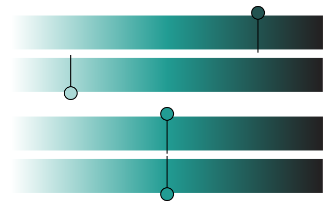
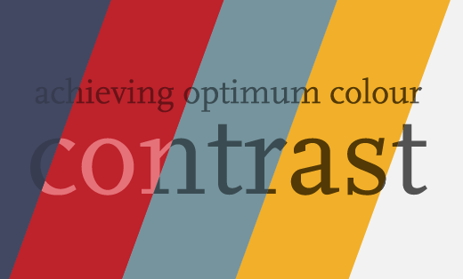
Black and white have the highest contrast ratio. So a colour near to white will have better contrast against a colour near to black. As the two get closer to the same level of lightness, the contrast diminishes and your text becomes more difficult to read. We can demonstrate this using shades of grey or any single colour.
The image below shows a green that fades out to white on the left (as if gradually more white had been added) and to black on the right (as if gradually more black had been added).
Choosing a shade nearer to black and pairing it with one nearer to white will give us a good contrast ratio. The closer the shades are, the lower the contrast. When they line up on the spectrum they are identical and we have 1:1 – no contrast.
The measurement of contrast is independent of hue. We can do the same with two different colours and the same contrast ratios will result.
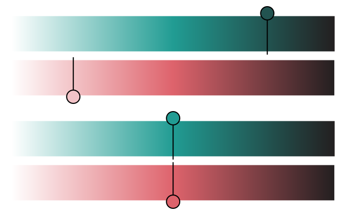
It can be helpful to imagine colour combinations in terms of how they would look in black and white because this helps to focus on the lightness of the shades, rather than their hues.
Contrasting colours
Colours on opposite sides of the colour wheel are known as ‘contrasting’ colours. This is a different meaning of ‘contrast’. Pairs of contrasting colours that are around halfway between white and black will have little to no contrast in terms of accessibility. While pairs of contrasting colours where one colour is closer to white and the other is closer to black will have better contrast in terms of accessibility. Very saturated contrasting colours can look so jarring that they are hard to read – particularly with lighter weight fonts.
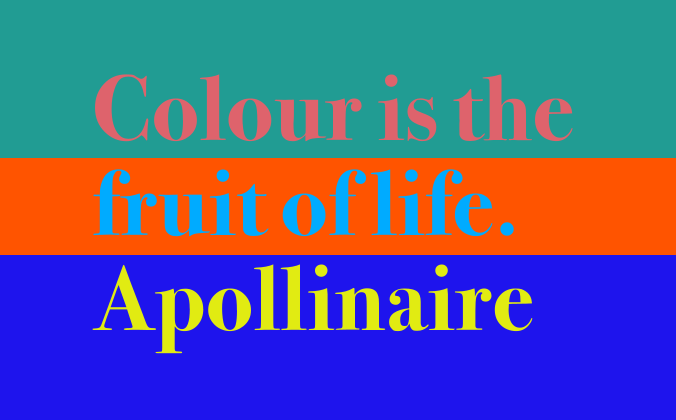
You can still use pairs of contrasting colours, such as red and green, providing they are sufficiently different in lightness, but keep in mind the potentially jarring nature of these combinations.
Colour blindness
We need to consider colour blindness in addition to and separately from colour contrast. Some forms of colour blindness will affect how light or dark a colour appears, which affects the level of contrast with surrounding colours.
In addition to this, if you use colours to convey information (red dots to mean ‘sold’, green dots to mean ‘available’) then anyone with red/green colour blindness will quickly run into difficulties, regardless of the contrast between the two colours. Someone with red/green colour blindness will be unable to distinguish between a light red dot and a dark green one as they’ll each appear as shades of brown.
How much contrast is enough?
WCAG stands for Web Content Accessibility Guidelines, but they are a good benchmark for publications in any medium. Success Criterion 1.4.3 of WCAG 2.0 requires ‘enough contrast between text and its background so that it can be read by people with moderately low vision’. That might apply to anyone trying to read in transient or situational circumstances such as low light or shiny packaging – not just those with visual impairments.
WCAG’s colour contrast requirements for text are categorised by size:
- ‘Normal’ text is any text set in 14pt (not bold) or smaller. Normal text needs a contrast ratio of at least 4.5:1 with the background.
- ‘Large’ text is any text set in at least 18pt, or bold and at least 14pt. Large text needs a contrast ratio of at least 3:1 with the background.
Curved balls
As described above, WCAG 2.0 uses an algorithm based on lightness. In turn, programmatic checkers assess colour combinations using this algorithm. But we already know that human perception of colour isn’t quite so simple. The algorithm is anticipated to be changed in the next release of the WCAG standard. Until then, results in programmatic checkers will continue to fail some combinations that look ok, and pass others that appear harder to read.
This is a good example of why prioritising a good user experience can be more important than adhering to a standard or passing a programmatic checker.
Have questions? Ready to get started?
To find out more or discuss how I could help you navigate the accessible PDF project process, please send me a message.
Get in touchRelated posts
 Recent posts
- Accessible PDF heading structure and the problem of phantom headings
- Accessible colour contrast for text
- How we can work together on accessible PDFs
- Acronyms & initialisms
- The best fonts for accessibility
Featured posts
Briefing a designer
Eight reasons to use freelance creatives

Putting a freelance designer at the heart of your project

Hello! I’m Sarah, an independent typographic designer.
I’ve been sharing my knowledge about design, typography, marketing, branding and printing since 2014. I hope you enjoy reading my blog.

Sarah Cowan