Design theories: design beyond aesthetics
Friday 28 January 2022
The Gestalt Principles of similarity, proximity, closure and figure-ground.
Friday 28 January 2022
The Gestalt Principles of similarity, proximity, closure and figure-ground.
To design publications that are easier to understand, designers must often make conscious decisions to reduce the cognitive load on the end-user. One way to do this is by understanding and applying design theories that have evolved from empirical research.
Research into how humans interact with text-based information sources spans the fields of both typography and psychology. And when clarity of message is the primary concern, research in both areas is relevant in informing the best approach to document design.
Of course, research can be affected by familiarity bias. For example, when serif typefaces are prevalent, readers will be accustomed to seeing and reading text set in typefaces with serifs. Such familiarity increases the likelihood of research participants finding serif typefaces easier than sans serif to read – simply because they are used to reading them.
Despite this, some research has stood the test of time, becoming accepted theories of document design. These theories support clarity and hierarchy in communication design. But in doing so, they also contribute towards designs that feel calm and organised. And that is visually pleasing in itself.
There are many theories of design psychology, covering topics such as colour theory, semiotics, recall or bias. For this article, I’m looking at similarity, proximity, closure and figure-ground – four of the Gestalt Principles of Perception.
Squarely in the overlap between psychology and design, these principles describe how the human brain perceives groups of objects. Importantly for designers, the perceptions are predictable, meaning we can confidently employ their effects to clarify messages.
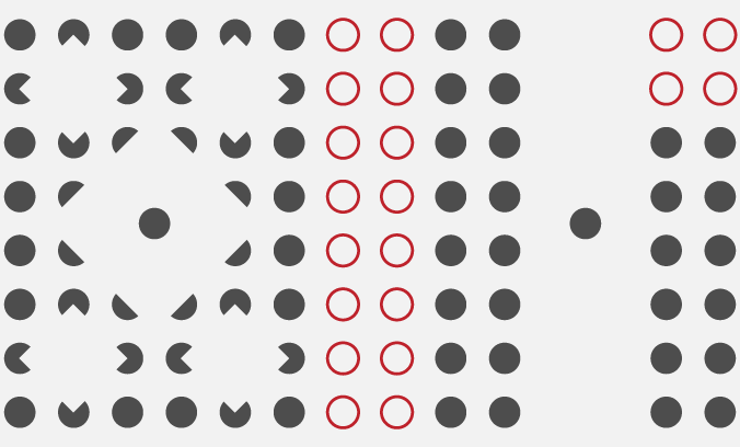
We see objects as a group if they share visual characteristics like size, colour or shape. Similarity can create groupings, even if the items are not next to one another.
The grey dots form one unit, while the red circles form another.
Visual similarity is used in design to help identify elements that should be read together or assigned the same level of importance. For example, using the same typeface, size and colour for all headings of the same level in the hierarchy helps provide a clear structure for information.
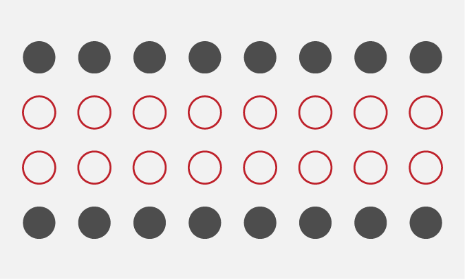
The human eye sees items placed near one another as a group – even if they do not share the same visual characteristics. We also consider grouped objects to have a similar meaning.
This time additional space forms the grey dots into two clear groups.
Proximity is a powerhouse in design, working at all scales on the page. It tells us that the letters of a word belong together rather than with the word before or after. But it also clarifies page layout, like the main body of text and the sidebar on this page.
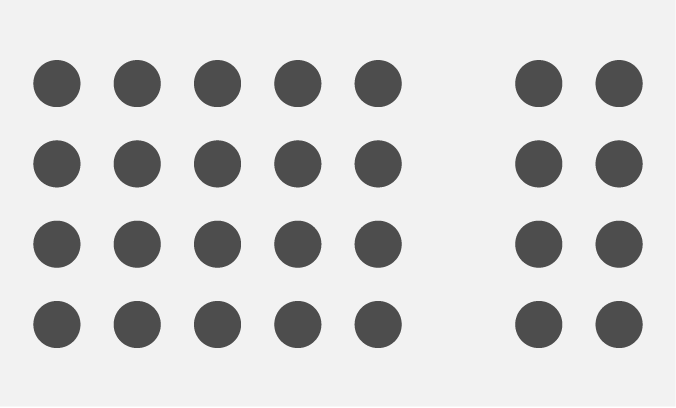
If we can see sufficient visual information, we ignore missing elements in an image and instead see complete shapes. A great example of this in action is the WWF logo, which is immediately recognisable as a panda, even though the outline is incomplete.
We instantly see three squares in this image, even though they are not outlined.
In the example above, the squares are not, in fact, there. They are suggested simply by the missing sections of the grey dots. Our brain is completing those shapes to produce the squares.
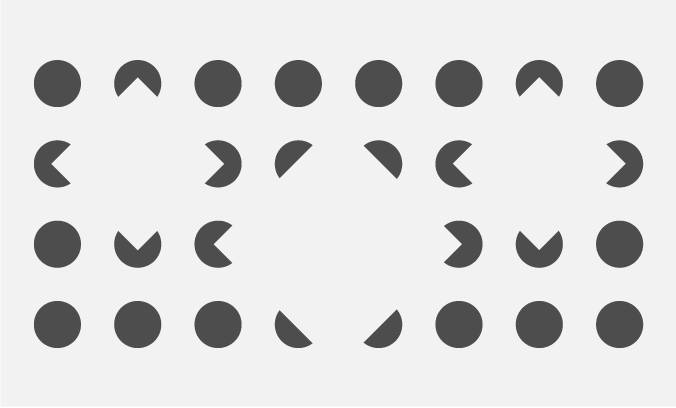
We perceive visually dominant (based on size or contrast) elements as foreground figures and see them first. Recessive objects become the background. Sometimes, foreground and background are visually equal, allowing us to see either as the dominant element.
Although much smaller, we see the grey dot as the figure against a pale grey ground.
When taken to extremes, conflicts between figure and ground result in optical illusions. The master of this tactic was MC Escher. Designers often play with the idea of negative space in logos where the ‘ground’ contains content in addition to the figure itself.
Related posts
Design accessibility standards: design beyond aesthetics
27 May 2022
Design for communication: design beyond aesthetics
25 February 2022
Design beyond aesthetics
26 November 2021
![]() Recent posts
Recent posts
![]() Featured posts
Featured posts

Briefing a designer

Eight reasons to use freelance creatives

Putting a freelance designer at the heart of your project

Hello! I’m Sarah, an independent typographic designer, helping businesses to communicate their unique selling points through printed marketing and communications.
I’ve been sharing my knowledge about design, typography, marketing, branding and printing since 2014. I hope you enjoy reading my blog.

Sarah Cowan