Choosing the right typeface for your business or brand
Friday 27 May 2016
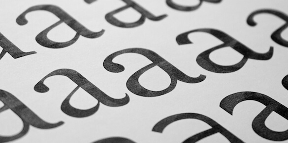
In isolation, one letter ‘a’ can look a lot like another.
Friday 27 May 2016
In isolation, one letter ‘a’ can look a lot like another.
Typeface choice is an often overlooked way of creating a visual style for your business. When viewed in isolation one letter ‘a’ may look a lot like another, but even small differences in type style will have a noticeable impact on the overall appearance of your marketing materials. But with thousands of typefaces available – how can you possibly know where to start?
The main aspect that most people consider is what the typeface looks like. And it’s a good place to begin. But there are also technical, practical, and even financial aspects that it’s important to bear in mind if you want to save yourself headaches later on.
Typefaces can either be plain, vanilla or invisible; or they can have an overt style. A vanilla typeface melts away revealing the message*, whereas a typeface with a more pronounced style adds its own message above and beyond what the text itself says. If your message is serious and important then you should aim for vanilla for long copy. You can always add interest by using a more stylized typeface for things like headings.
When choosing a more overtly styled typeface it’s important to consider any historical or cultural implications that may or may not have an appropriate synergy with your brand. For example, a business that markets itself as vintage would want to research typefaces carefully to choose something either from the right era, or of the right style. And the similarities between the Fraktur typefaces widely used in Nazi Germany and the Old English typefaces commonly found on Ye Olde Tea Shoppes are a disaster waiting to happen!
As a quick check imagine you’re going to present your marketing materials to your target audience in person. What are you wearing? A suit? Jeans and a t-shirt? A clown’s outfit? Dressing your text with your typeface choice is not unlike dressing yourself.
Most typefaces were originally designed with a particular use in mind, or to solve a particular problem like fitting a lot of copy into a small space such as a dictionary or phone directory, or coping with ink-squash when printing onto reel-fed newsprint. To get maximum value out of a typeface it’s worth choosing one that was created for your intended use.
Continuity of style across all your materials helps reinforce your brand, so you should also consider how your typeface choice will work across print and screen environments. Technology today allows you to use a huge range of typefaces on a web site. But bear in mind that some will be more suited to this than others, so you may choose to use two similar typefaces – each optimized to its own environment.
It’s important to choose a typeface which has all the fonts and characters that you need. Most typefaces have an italic and a bold, but you may also need a bold italic, or a semi bold. Character sets in typefaces can be huge, but they can also be very restricted. You may want to use old style numerals (lowercase numbers), small caps, mathematical symbols, etc. If you think you might need them, check they are available.
You hopefully have some idea of the target audience for your business. If they are old, young, sight impaired, or disabled then this will have an impact on the typeface that you should choose. For everyone else there are basic standards of legibility and readability that it’s important to meet to make sure your marketing communications are easily read.
Last but by no means least, is the cost of your typeface choice. There are many free options out there, but you may decide it’s worth paying for a typeface with the right attributes. Using the same bog-standard typeface as everyone else is not going to help you stand out from the competition! However, be aware – purchasing an extended typeface family can become expensive, particularly if you need to buy licences for a large groups of users.
* If you are interested in this idea you can read more by Googling Beatrice Warde and The Crystal Goblet
If you’re still not sure where to start choosing a typeface for your business, I can help.
Related posts
Typeface licensing
29 November 2019
Why fonts really do matter
29 April 2016
Type size demystified
17 February 2015
![]() Recent posts
Recent posts
![]() Featured posts
Featured posts

Briefing a designer

Eight reasons to use freelance creatives

Putting a freelance designer at the heart of your project

Hello! I’m Sarah, an independent typographic designer, helping businesses to communicate their unique selling points through printed marketing and communications.
I’ve been sharing my knowledge about design, typography, marketing, branding and printing since 2014. I hope you enjoy reading my blog.

Sarah Cowan