Golden numbers
Friday 26 June 2015
The spiral from the Golden Rectangle is found in sea shells – most noticeably in that of the nautilus.

Friday 26 June 2015
The spiral from the Golden Rectangle is found in sea shells – most noticeably in that of the nautilus.
The Fibonacci Sequence is a series of numbers where each number is the sum of the two preceding numbers. For example: 1, 1, 2, 3, 5, 8, 13, 21, 33, and so on.
Part of the magic of this sequence is that as it progresses the ratio between each number and the next (that number divided by the previous number) settles at approximately 1:1.618034. This ratio has become known as the Golden Ratio.
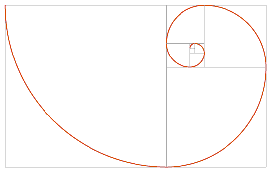
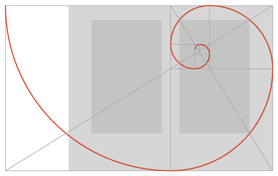
A visual representation of the Fibonacci Sequence can be seen in the Golden Rectangle, which is built from squares corresponding in size to the numbers in the Fibonacci Sequence. Taking this a step further, we can trace a spiral through the sequence of squares with each square having a quarter circle.
The Fibonacci Sequence, the Golden Ratio, and the spiral are frequently seen in nature, and have been imitated for centuries in visual arts of all kinds. For example, you will find the Fibonacci Sequence in pine cones, flowers, and pineapples, and the spiral from the Golden Rectangle is found in sea shells – most noticeably in that of the nautilus.
Whether from familiarity through omnipotence or genuine superiority, the ratio of 1:1.618034 is considered to be perfectly balanced.
In graphic design these theories can be applied very successfully to provide pleasing proportions to divisions of space, or the size of related elements. The size and placement of almost every element on the page could theoretically be determined using the Golden Ratio. The page size itself, the width of columns, the shape and position of the text block, and the relative size of images can all be calculated using the same principles.

Why would we do this? Well, the eye often responds well to visual harmony. A page that has pleasing proportions will be more restful to look at, which is ideal for long reads like novels or textbooks. For designers it helps to provide a framework to work within, and often to deviate from where needed. In a calm and pleasingly proportioned design it is possible to make important messages stand out simply by breaking the pattern.
Recent posts
Featured posts

Hello! I’m Sarah, an independent typographic designer, helping businesses to communicate their unique selling points through printed marketing and communications.
I’ve been sharing my knowledge about design, typography, marketing, branding and printing since 2014. I hope you enjoy reading my blog.

Sarah Cowan