Comic Sans
Friday 25 May 2018
The typeface people love to hate. But is the font itself at fault – or is it the inappropriate way it has been used?
Friday 25 May 2018
The typeface people love to hate. But is the font itself at fault – or is it the inappropriate way it has been used?
I think it’s fair to say that it would have been frowned upon to use Comic Sans in any of my projects during the four years of my typography degree. And while I don’t recall ever being told not use it, I also cannot remember completing a project where it would have been appropriate to do so.
And that’s important because choosing a typeface largely boils down to this: you must choose the most appropriate typeface for the job in hand. Not the one that’s in fashion, the one you have just bought, or even your favourite. Choosing the right typeface is more complex and is tied up irrevocably with what you need to say, where you need to say it, and who you are saying it to.*
It is through this lens that I am considering Comic Sans.
Designed in 1994 by Vincent Connare, the clue about Comic Sans is in its name. Inspired by the handwritten captions Connare found in comics of the nineties, it was intended for a very specific project – to give a friendly and un-intimidating ‘voice’ to a cartoon dog who appeared as a virtual assistant in a computer programme.
But ever since it was released as a system font by Microsoft, Comic Sans has attracted more than its fair share of derision and dislike. Many designers and typographers have expressed extreme antipathy towards the typeface. There was even a movement dedicated to banning it altogether. And when it is used in inappropriate scenarios – gravestones have been mentioned – I would have to agree. And yet, it’s not the typeface itself which is at fault – simply the inappropriate way in which it has been used.
All this seems to suggest that there might actually be a scenario in which Comic Sans is an appropriate choice. If you read Simon Garfield’s book Just My Type you will find a footnote on page 27 which reads:
Both Trebuchet [another of Connare’s typefaces] and Comic Sans are highly regarded by those who work with dyslexic children – their easy, unthreatening clarity proving far more accessible than harsher and more traditional fonts.
And so, when I met ex-designer and Dyslexia Tutor Alison Watson of Borders Literacy Tuition recently, I jumped at the opportunity to ask her more about this very subject.
SC Alison, do you agree with Simon Garfield, that Comic Sans is highly regarded among those who work with dyslexic children?
AW Yes, sadly I do. I say sadly because as an ex- graphic designer Comic Sans is an anathema to me. Now, working with young people with dyslexia, I see it being heavily used in schools. It’s a friendly, fun font, so it does work well within in a primary education environment.
SC And what about education environments beyond the primary years?
AW In my experience, Comic Sans rightly disappears in secondary education as children are exposed to a variety of texts for different purposes. I’ve found that adults with dyslexia don’t like it as it appears too childish for them. So, its place is with young children who are learning read and write.
SC What do you think it is about Comic Sans that makes it successful with young children?
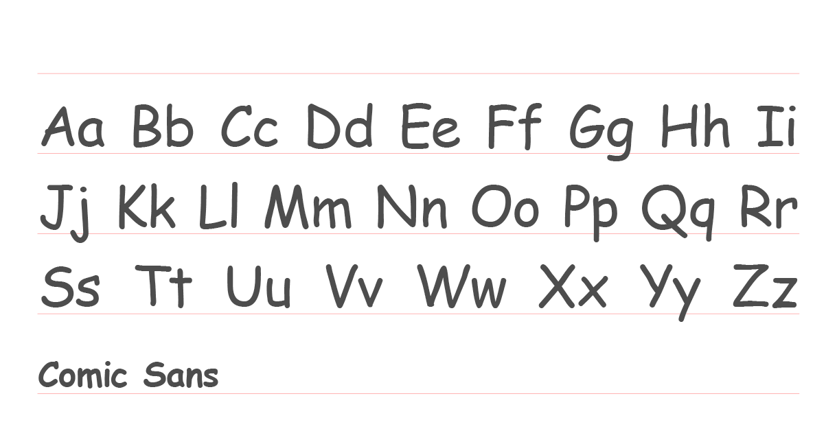
AW My understanding is that it is the closest font to how handwriting is taught, in particular the ‘a’, [which is single story, as a child would write it, rather than double-story as is seen in many more formal typefaces].
SC I read a theory suggesting one of the advantages of Comic Sans is that it doesn’t have any rotational symmetry between the often-confused characters – for example, ‘d’ is not simply a rotated ‘p’. Is that something that you have encountered?
AW Yes. Mirror images can be problematic for people with dyslexia, due to visual processing difficulties. So it’s very common to get ‘d’s and ‘b’s or/and ‘p’s and ‘q’s muddled up. Although in these cases, learning support strategies for letter or word identification is the best approach, rather than relying on the fonts differentiations between these letters.
SC Comic Sans is a relatively young typeface, only having been designed in 1994. Before this date was there another typeface which was commonly favoured for use with dyslexia?
AW I’m not sure about this and I’d be very surprised if there was. Dyslexia used to be known as ‘word blindness’ and not really understood, leaving people who couldn’t read and write feeling they were stupid – which they weren’t. Now, with MRI scans, we know people with dyslexia’s brains are wired differently.
SC So do you think the arrival of Comic Sans has been beneficial for people with dyslexia?
AW Yes, I think it’s certainly helped children who are learning to read and write. I don’t think we should get too hung up on fonts alone as far as dyslexia goes though, as there are many teaching strategies for supporting people.
SC It sounds as though there is more that designers could do to help.
AW Yes! A well-designed website should have accessibility options to ensure people with sensory disabilities are not discriminated against. There should be options to change the background colour, the font colour, font size and ideally there should be a text to speech option. And printed design can be made more inclusive by printing on offwhite or buff paper, rather than white paper, as many people with dyslexia have visual stress and have to use colour overlays.
SC Thank you Alison!
Vincent Connare himself remains admirably stoical about all the conflicting opinions on his design. And so I wanted to give the last word to the man himself:
If you love Comic Sans, you don’t know much about typography. If you hate it, you really don’t know much about typography, either, and you should get another hobby.
Vincent Connare
* Find out more about what you should consider when choosing a typeface in my blog post Choosing the right typeface for your business/brand.
Related posts
Choosing the right typeface for your business/brand
27 May 2016
![]() Recent posts
Recent posts
![]() Featured posts
Featured posts

Briefing a designer

Eight reasons to use freelance creatives

Putting a freelance designer at the heart of your project

Hello! I’m Sarah, an independent typographic designer, helping businesses to communicate their unique selling points through printed marketing and communications.
I’ve been sharing my knowledge about design, typography, marketing, branding and printing since 2014. I hope you enjoy reading my blog.

Sarah Cowan