Typesetting – the finishing touches
Friday 26 February 2016
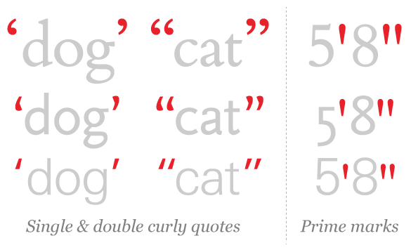
Curly quotes look different in each typeface. Prime marks look quite different.
Friday 26 February 2016
Curly quotes look different in each typeface. Prime marks look quite different.
This blog post follows on from ‘Seven steps to more professional typesetting’ which covered ‘macro’ typography – making your copy look good on the page. I would now like to take this idea a little further, and show you a few quick ways to refine the appearance of your text at a closer, or ‘micro’ level.
A full stop at the end of a sentence indicates the end of one thought and the pause which is intended to follow it. The question is how many spaces should sit after the full stop – one or two? This is one of those issues that seems really to divide people – and they are all certain they are right!
I am, without hesitation, in favour of one space between sentences. My reasons? The established mechanism for indicating the end of a sentence is the full stop. Including an unusually large space in addition to this seems to be somewhat superfluous. For the reader the inclusion of an additional space can be distracting, disrupting the flow more than is intended. If such a long pause is required after a sentence it may be more appropriate to indicate this by beginning a new paragraph. From a typographer’s perspective the large gaps created by double spaces can visually combine where the double spaces coincide on consecutive lines and form distracting and unattractive ‘rivers of white’ running through the text.
My recommendation, therefore, is to use just one space between sentences.
Some word processing programmes will automatically convert your quote marks and dashes into the correct forms. Check the software’s preferences if you want to activate or edit this feature. If your software can’t do this, or if you want to be able to check manually then it’s worth knowing what to look for.
Quote marks in their correct form are generally curly – looking like a small 6 or a 9 in their single form, or 66 and 99 as double quotes. The quote marks in some typefaces are actually not that curly simply because of the style of the type – you may see a slight asymmetry if you look closely. What you want to avoid is the incorrect use of a prime mark, which is straight, and which is properly used to denote feet and inches.
My recommendation for quote marks is to use single quotes first, and double quotes within, if needed. The reason for this is to keep the number of marks on the page to a minimum for the purposes of clarity. For example:
‘Jim said that I could have “the best” balloon’, said Peter.
En-dashes are the correct type of dash to use when inserting parenthetical statements into your sentence, or indicating ranges of numbers, for example. In this instance you are looking to avoid the use of the shorter hyphen – which is used to link compound words, or indicate a word which is split across lines – rather than an en-dash.
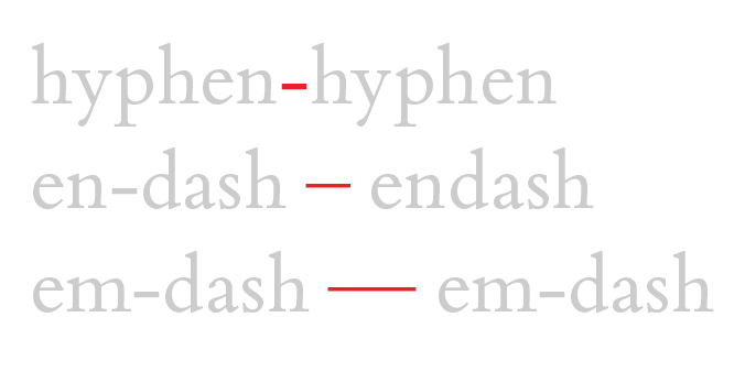
Hyphens, en-dashes, and em-dashes vary in length and weight.
Again, there are stylistic considerations about whether you use an en-dash, or its longer sibling, the em-dash. Make sure that whichever you choose to use you are consistent.
These are the very last checks you should make on your text because they involve introducing artificial page, column, and line breaks which will need to be changed if you subsequently make any edits to your copy.
Widows are words or lines of text which have nothing following them – generally the first line of a new paragraph which appears on its own at the bottom of a page or column. Orphans have nothing before them – the last line of a paragraph which appears on its own at the top of a column or page. Try to avoid both by moving page and column breaks since these lines of text are very easily missed by the reader.
Finally, hanging words. This will occur in any text which is left or right aligned and a ragged edge (rag) will appear where the lines all end at different points. Scan down the rag to find any words which don’t have another word supporting them underneath. To get rid of these insert a line break (use Shift + Return to avoid starting a new paragraph) so they drop down to the next line. Don’t worry so much if just the last part of a long word is hanging, but if a whole word – particularly if it is very short – is hanging, try to get rid of it.
These are just a few of the techniques a professional typographer will use to make copy look better and make it easier for your audience to read. If you would like to know more about how a typographer could help you to communicate your message more clearly don’t hesitate to get in touch.
Related posts
Seven steps to more professional typesetting
Friday 22 May 2015
![]() Recent posts
Recent posts
![]() Featured posts
Featured posts

Briefing a designer

Eight reasons to use freelance creatives

Putting a freelance designer at the heart of your project

Hello! I’m Sarah, an independent typographic designer, helping businesses to communicate their unique selling points through printed marketing and communications.
I’ve been sharing my knowledge about design, typography, marketing, branding and printing since 2014. I hope you enjoy reading my blog.

Sarah Cowan