Emphasizing your point
Friday 26 March 2021
Over-emphasizing words will disrupt the reader and make your text look significantly less polished and professional
Friday 26 March 2021
Over-emphasizing words will disrupt the reader and make your text look significantly less polished and professional
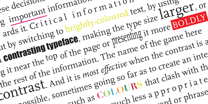
I use colour, shape, placement and size very intentionally when deciding how to present information. Aside from any aesthetic effects, these decisions create a hierarchy of information, emphasizing important information and drawing attention towards it.
For example, I might make critical information stand out by switching to brightly-coloured text, using a contrasting typeface, making the type size larger, placing it near the top of the page or presenting it more boldly than the rest of the information.
The name of the game here is contrast. And it is most effective when the contrast is as great as possible, sometimes going so far as to create an intentional visual jarring – such as colours that clash with those used elsewhere.
But while these techniques work well at a page layout level, they are much less appropriate when you only want to emphasize a single word or phrase within a longer passage of text. Why?
Running text – such as that found in a report or white paper – needs to have an overall harmonious appearance to support the reading process. This means that individual words and phrases should be emphasized in a way that does not disrupt the fluency of reading. A much more subtle distinction is needed – something which is just sufficient to make sure the important word is noticed.
One way to do this is to use italics. Most text typefaces (as opposed to display faces) have a matching italic, and many look different enough from their roman counterparts to be noticed. They are also specifically designed to work together, which makes this a very simple solution.
If italics are not available or they are not appropriate for another reason, a good alternative might be to use the next weight up of the same typeface, be that a semi-bold or a bold. Not all typefaces are well suited to this technique. Take care not to under- or over-emphasize when using bold: the next weight up might not offer sufficient contrast, or there might be too much difference between weights.
Using colour to successfully emphasize an individual word or phrase within a passage of text, without disturbing the fluency of reading is much harder to do.
The ‘emphasizing’ colour needs to have the same strength and contrast with the background as the rest of the text while simultaneously being different enough from the rest of the text to stand out to just the right degree. If we rely on colour alone in this situation then we must also anticipate that there will be people who don’t see that difference in the same way that we do due to colour blindness.
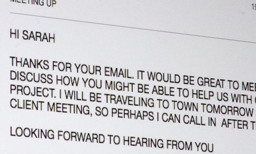
To make long passages of text as easy and enjoyable to read as possible, it’s best to avoid emphasizing words and phrases using uppercase or underlining or by changing the type size, typeface, word shape or alignment within the flow of the text. These techniques will over-emphasize the important words or break the rhythm of the text, disrupting the reader and making your document look significantly less polished and professional.
Whether you have a quick question, would like a second opinion or someone to typeset your reports for you, just get in touch.
Related posts
Using capitals without shouting
26 October 2018

How we read & why that matters
25 August 2017
Typesetting – the finishing touches
26 February 2016
![]() Recent posts
Recent posts
![]() Featured posts
Featured posts

Briefing a designer

Eight reasons to use freelance creatives

Putting a freelance designer at the heart of your project

Hello! I’m Sarah, an independent typographic designer, helping businesses to communicate their unique selling points through printed marketing and communications.
I’ve been sharing my knowledge about design, typography, marketing, branding and printing since 2014. I hope you enjoy reading my blog.

Sarah Cowan