How we read & why that matters
Friday 25 August 2017
Being able to process almost infinite combinations of twenty-six letters into meaningful information is impressive when you stop to think about it.
Friday 25 August 2017
Being able to process almost infinite combinations of twenty-six letters into meaningful information is impressive when you stop to think about it.
Reading is something which most adults take for granted. But being able to process almost infinite combinations of twenty-six letters (along with punctuation, numerals, etc) into meaningful information at speeds that are so fast it’s almost imperceptible, is impressive when you stop to think about it.
The two main psychological theories behind how we do this are word shape, and parallel letter recognition.
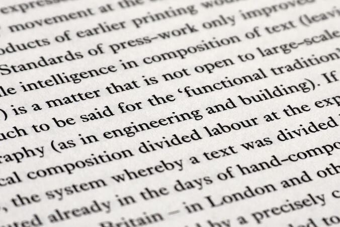
The theory of recognizing the shapes of words is an old one – dating back to the late nineteenth century to a psycholinguist called James Cattell. It is based on the idea that the letters in a word give it a unique outline shape which we are able to recognize.
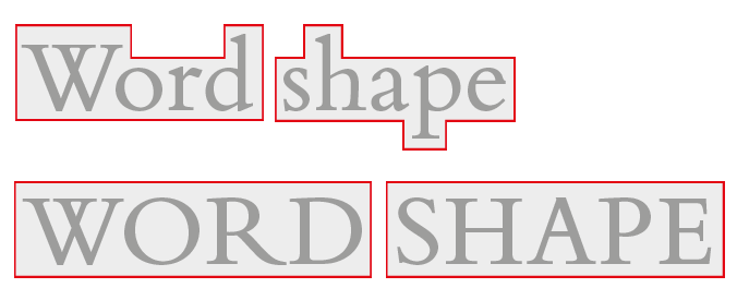
Word shape theory suggests that we recognize words by the outline shape the letters create. Uppercase words don’t create the same distinctive shape.
This theory has been backed up with various experiments – the most commonly cited being that the word shape is a key part of the reading process because when you remove it (by presenting the text in uppercase) the words become harder to read and are read more slowly.
In more recent years research has had the advantage of modern eye-movement studies. This has resulted in a new theory that when we read we are actually recognizing the letters in a word simultaneously, which then in turn allow us to recognize the word.
Of course, parallel letter recognition doesn’t explain why words presented in uppercase text (and without a distinctive outline) are slower to read. The generally accepted reason today, however, is because we are not accustomed to reading it. The same effect can be seen when reading a page of blackletter type, or text that is presented backwards. Familiarity has an important part to play in readability.
Eye-movement studies have shown us that when we read our eyes do not travel along the line of text in one smooth motion. They move along in a series of short arcs called saccades. Each saccade covers about 7–9 characters, before we pause (a fixation) for a fraction of a second.
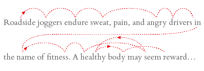
When we read our eyes move in a series of small movements called saccades, and pauses called fixations. Illustration based on a model by Kevin Larson at Microsoft
During the saccade we aren’t actively seeing anything. The ‘reading’ happens during the fixations when we are able to recognize words at the fixation point, gather information about the letters just outside the fixation zone, and use our peripheral vision to choose the next suitable fixation point. Once at the end of the line, our eyes move to the first fixation point on the next line.
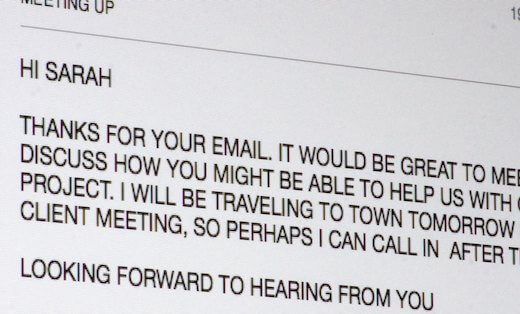
It is proven that using uppercase is likely to slow reading speed down since we are not familiar with text that is presented in this way. Since it is harder to read it is probably preferable to reserve it for short pieces of text and headings, rather than using it for long passages. Bear in mind that uppercase text can also give the impression that the writer is shouting.
Choose a line length which is long enough to allow a rhythm of saccades to develop, but short enough that the return ‘jump’ isn’t too hard for the eye to make without error. Line length will need to be considered in conjunction with line spacing in order to avoid problems.
Help the reader to make the jump to a new line by ensuring lines begin in a constant location. Text that is right aligned will have a ragged, or uneven, left hand edge, making picking up the next line harder than necessary.
To chat about how I could use typography to make your materials easier to read, please send me a message.
Related posts
Using capitals without shouting
26 October 2018
![]() Recent posts
Recent posts
![]() Featured posts
Featured posts

Briefing a designer

Eight reasons to use freelance creatives

Putting a freelance designer at the heart of your project

Hello! I’m Sarah, an independent typographic designer, helping businesses to communicate their unique selling points through printed marketing and communications.
I’ve been sharing my knowledge about design, typography, marketing, branding and printing since 2014. I hope you enjoy reading my blog.

Sarah Cowan