What is visual identity?
Friday 27 March 2020
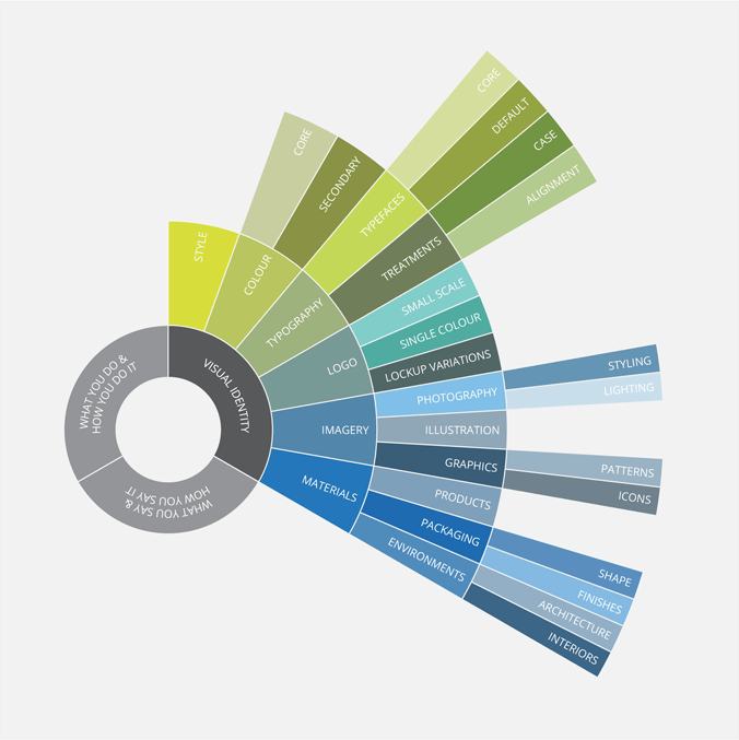
Visual identity is the sum of all the branding decisions that you can see.
Friday 27 March 2020
Visual identity is the sum of all the branding decisions that you can see.
Visual identity is the sum of all the branding decisions that you can see. That might be colours, typefaces, style of illustrations, graphics or photographs, and the precise way you combine and apply these elements.
There are also valuable crossovers into other senses such as touch, which can perform a useful role in the creation of visual identities. Think about the texture of paper and various finishes such as foiling and varnishes – information that people often ‘receive’ through touch.
In terms of real-estate, a logo is just one tiny fragment of a visual identity. Yet there is a widespread misconception that simply adding your logo to a document makes it branded. And that rather misses the point. Because while your logo alone can’t instantly make something branded, combining the other pieces of the branding jigsaw (other than a logo), can.
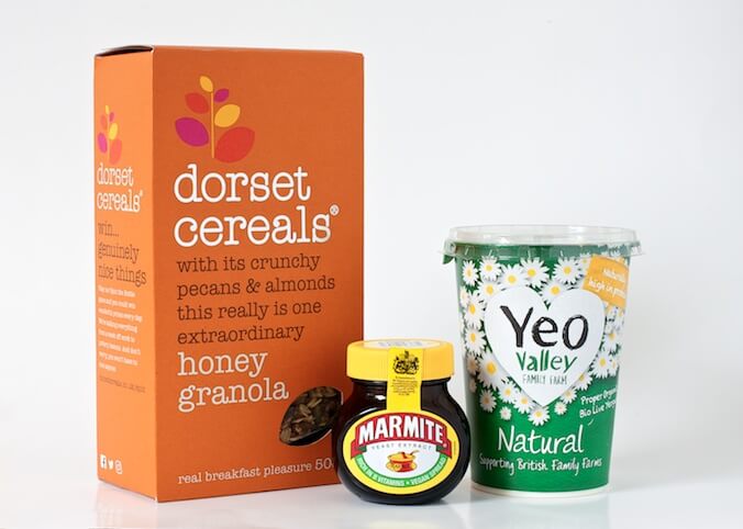
Packaging from Dorset Cereals, Marmite, and Yeo Valley Family Farm
Dorset Cereals uses a very distinctive, almost exclusively typographic style in its product packaging. Combined with the uncoated board, which is an unusual choice of material in cereal packaging, a down-to-earth tone of voice, and the almost exclusive use of lowercase letters, it’s easy to recognise their products.
Marmite uses shape and colour to differentiate their product on the supermarket shelves. The dark brown rounded jar with its bright yellow lid would be easily recognisable even without the label on it. Riding on Marmite's coattails, the yellow and brown colour combination has been mimicked by Vegemite – one of Marmite's competitors.
And finally, Yeo Valley Family Farm uses a distinctive hand-drawn illustrative style. They also display some of their brand’s ethics on their packaging via their strapline ‘Supporting British Family Farms’.
These three brands use colour, materials, typography, text case, shape, illustrative style (as well as tone of voice and brand ethics) alongside their logo. In all three instances, the logo could easily be removed and the branding impact would be just as strong. Although their logos are so well integrated into the overall design that in all three instances it’s not immediately obvious where the logo stops and the packaging design begins.
Don’t hesitate to get in touch.
Related posts
Branding is more than just your logo
30 April 2021
Brand foundations
30 April 2021
What is verbal identity?
26 June 2020
![]() Recent posts
Recent posts
![]() Featured posts
Featured posts

Briefing a designer

Eight reasons to use freelance creatives

Putting a freelance designer at the heart of your project

Hello! I’m Sarah, an independent typographic designer, helping businesses to communicate their unique selling points through printed marketing and communications.
I’ve been sharing my knowledge about design, typography, marketing, branding and printing since 2014. I hope you enjoy reading my blog.

Sarah Cowan