
Pass the phrasebook
Friday 27 July 2018
Friday 27 July 2018
If you’re heading overseas for your holidays this summer then the chances are that at some point while you’re packing you’ll mutter to yourself the words ‘passport, tickets, money’.
This familiar checklist seems to cover all the holiday essentials. But once you’ve arrived at your destination you might begin to feel you’ve forgotten something. Your international pictogram phrasebook.
At present, it seems that you need to be fluent in both the local language and ‘native pictogram’ in order to be able to navigate your way through a foreign airport, railway station or ferry port. And if you’re travelling to a country with a non-Latin alphabet, then a lack of readily understandable pictograms can render you illiterate.
There are around two thousand eight hundred languages in use in the world. And for many people who travel extensively to far-off lands each year, it would be invaluable to have a commonly-understood way to convey simple, succinct sets of instructions, directions, or warnings – such as those necessary in an airport where the result of misunderstanding could be anything from mild irritation to extreme danger.
In order to achieve effective multilingual communication of this sort, especially in places where space or reading time is limited, we have returned to a pictographic method of communication last used in the pre-modern world.
It is widely accepted that symbols have the potential to transcend language, which makes them ideal to use in places like airports where many foreign visitors will need to follow their directions. Pictograms are also small and suitably shaped to fit on signs which because of practical limitations of size are not suited to linear language and multiple translations.
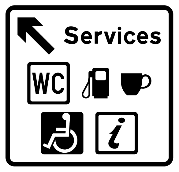
Symbols take up less space on a road sign, as well as being easier to pick out the service you want
It has also been claimed that in some situations symbols can be understood more rapidly and/or with greater accuracy than words. For example, a written list of the facilities available at a service station would be impossible to read on a road sign. The passing motorist simply hasn’t got time to read it, even if they do understand the language. A symbol for a tea cup, however, may be identified rapidly whether speeding past at sixty miles per hour or sitting in a traffic jam, regardless of your native language. The language of pictograms would seem, therefore, to be ideal.
The most successful pictograms are intuitively knowable. This is rare, however, with the majority of symbols needing to be learnt. In addition to this, countries have developed their own sets of pictograms independently from one another. This means that learnt symbols do not function well when seen by visitors from another country.
A pictogram may be anywhere on the continuum from extreme realism (a mini drawing of an object) to total abstraction (a visual metaphor). Symbols indicating services or concepts are often abstracted, which can make them even less intuitive. A common example of this are the symbols used to indicate a toilet.
A toilet, as shown on the road sign above, is indicated by ‘WC’. This only makes sense if you are English-speaking, and know the somewhat outdated name for a toilet – a water closet. But when you arrive at the service station (or many other places) the silhouette of a man or a woman is generally used instead. These silhouettes create a disconnect between the content of the symbol and the object it refers to. The outlines depicting trousers for men and skirts for women are not only outdated (I rarely wear a skirt), they are also not representative of clothing shapes worldwide – even in Scotland, where men often wear kilts. But despite this, these symbols are still widely used in many countries.
Context and experience are also important in establishing the meaning of a pictogram. The same image could be used in different ways, in different contexts, and mean different things to different people, depending upon their life experience.
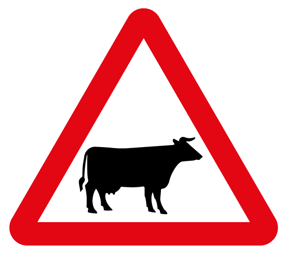
We have to learn what a picture of a cow on a road sign means
Providing you have seen one before, a picture of a cow looks like a cow, regardless of your native language. But what does it mean? In the UK if you see a picture of a cow on a road sign it signifies ‘cattle crossing’. This is something we have to learn, it’s not instinctive. If a cow appears on food packaging the product probably contains beef or dairy products. But if you are Hindu then the associations you make when you see an image of a cow are different, as the cow is a sacred animal. And if you have never seen a cow then the symbol will mean nothing at all.
Thinking back to our holiday-makers arriving at a foreign airport, they might expect to see an ‘i’ for ‘information’. But this no longer makes sense when the word for information no longer starts with an i – although interestingly, Japan has begun to adopt the ‘i’ despite it being based on an English word in a Latin alphabet. A question mark is used in some countries, which might seem sensible since an information desk is a place to ask questions. But if your plane lands in Egypt you might find the word ‘information’ written. In Arabic.
So, perhaps you’d better pack the phrasebook after all…
![]() Recent posts
Recent posts
![]() Featured posts
Featured posts

Briefing a designer

Eight reasons to use freelance creatives

Putting a freelance designer at the heart of your project

Hello! I’m Sarah, an independent typographic designer, helping businesses to communicate their unique selling points through printed marketing and communications.
I’ve been sharing my knowledge about design, typography, marketing, branding and printing since 2014. I hope you enjoy reading my blog.

Sarah Cowan