Why you need visual identity guidelines
Friday 29 January 2021
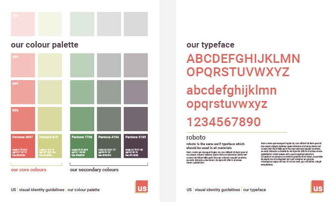
A colour palette and type spec from a basic visual identity guidelines document
Friday 29 January 2021
A colour palette and type spec from a basic visual identity guidelines document
Your organization’s visual identity is its visual language. Anyone who produces branded materials for you needs to understand its vocab, key phrases and grammar to speak it fluently.
We use a range of tools to learn new languages: a dictionary for vocabulary, a phrasebook for commonly-used phrases and a grammar primer to show us how to put it all together. We learn by following rules and studying examples.
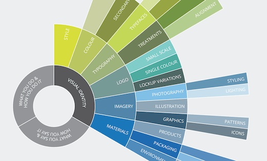
Visual identity guidelines provide the equivalent information needed to learn a visual language. They document all the visual vocabulary of your identity, the visual phrases and, importantly, demonstrate the grammar that ties it together.
Marketers and designers refer to guidelines by a variety of different names. ‘Corporate identity guidelines’, ‘style guides’ and ‘brand guidelines’ tend to be wider-reaching documents. They will include visual identity information, but they may also cover verbal identity, brand vision and brand values.
Every business will benefit from having design guidelines – regardless of size. The benefits broadly fall into two categories: saving time and money and achieving consistency. Both will be as important for a small business as they are for a multinational.
The advantages of saving time and money are self-evident. Achieving consistency might not immediately seem so important, but it is critical. People buy from people they know, like and trust. The first step on this journey is to achieve awareness and recognition. You are unlikely to recognize brands that always look different. But there is also a high chance that you won’t trust them.
Having more than one person produce content for your organization – whether internal or external – makes it hard to achieve consistency without the parameters that guidelines provide. And it makes it significantly harder to design content which looks unmistakably like ‘you’.
For example, achieving consistency across your social media profiles and web site is essential. If you outsource content generation for social media, then you risk the look and feel of information on your social channels being completely different. Users might click through to your web site to discover that the brand they were expecting to find, does not exist. This is confusing and frustrating for the user and a waste of the organizations marketing budget.
To avoid disjointed and inconsistent content, you need to document your visual style clearly and concisely. That is what visual identity guidelines should do.
Guidelines needn’t be complicated or expensive to produce. They can be as simple and straightforward as you need them to be. Even the process of pulling all the information together could be beneficial if it highlights inconsistencies that you can then address.
Whatever you publish, treat it as a living document. Keep it up to date as your visual identity develops and grows and add to it where needed. And then make it widely available and easily accessible to anyone who needs it.
Related posts
What to include in visual identity guidelines
26 February 2021
What is visual identity?
27 March 2020
![]() Recent posts
Recent posts
![]() Featured posts
Featured posts

Briefing a designer

Eight reasons to use freelance creatives

Putting a freelance designer at the heart of your project

Hello! I’m Sarah, an independent typographic designer, helping businesses to communicate their unique selling points through printed marketing and communications.
I’ve been sharing my knowledge about design, typography, marketing, branding and printing since 2014. I hope you enjoy reading my blog.

Sarah Cowan