
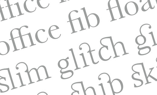

A serif is a non-structural part of a letter which is found at the beginning or end of the main strokes. They may appear on both sides of the stroke (bilateral), or just on one side (unilateral), and they vary enormously in shape and size. Letters without serifs are called ‘sans-serif’ (sans meaning without).
Where do they come from?
Serifs have their origins in two different places. In uppercase or capital letters the serif originated in stone inscriptions in Rome, first appearing around 44BC. The letters to be inscribed were first painted with a flat brush, before being cut with a chisel. The use of these two tools created small entry or exit strokes – or serifs – on the ends of the letters.
In 1989 Carol Twombly created a typeface called Trajan, which is a reproduction of the letters on Trajan’s Column from 113AD. In her digital version, it is possible to see how the brush strokes the stone cutter used shaped the letters.

Lowercase letters evolved separately from uppercase letters, being used in the creation of manuscripts rather than inscriptions. The use of a pen or quill created a different style of serif, but when lowercase letters began to be combined with uppercase letters the two styles evolved together retaining much of the inscriptional style.
What do they look like?
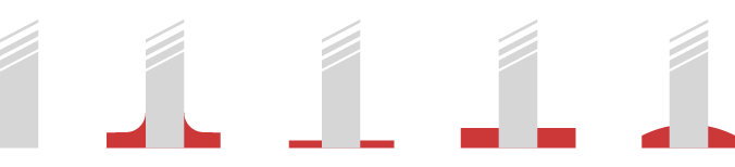
As letters have evolved, and different tools have been used to draw them, serifs have developed in many differing shapes. There are four basic styles – the bracketed style seen in inscriptions, but also the unbracketed styles of hairline serifs, slab serifs and wedge serifs.
What do they do?
Although serifs originally appeared because of the way that letters were drawn with a brush, it has since been claimed that they may help to increase the readability of text. One school of thought is that the serifs help to guide the eye along a line of text, thus assisting the reading process. Another idea is that reading text set with a serif typeface is easier because it is more familiar.
When choosing a typeface, the decision between using a sans serif or a serif depends upon more complex factors. Some serifs certainly are clearer than sans serifs, but the reverse can also be true depending upon the typefaces in question. Blocks of text which are set in particularly small sizes and any text which is reversed out of a dark background require particularly careful consideration, although type style, colour and size are also critical here. And of course, any text which is badly typeset will be less readable, regardless of whether it has serifs or not.
Related posts

 Recent posts
- Accessible PDF heading structure and the problem of phantom headings
- Accessible colour contrast for text
- How we can work together on accessible PDFs
- Acronyms & initialisms
- The best fonts for accessibility
Featured posts
Briefing a designer
Eight reasons to use freelance creatives
Putting a freelance designer at the heart of your project

Hello! I’m Sarah, an independent typographic designer.
I’ve been sharing my knowledge about design, typography, marketing, branding and printing since 2014. I hope you enjoy reading my blog.

Sarah Cowan