What to include in visual identity guidelines
Friday 26 February 2021
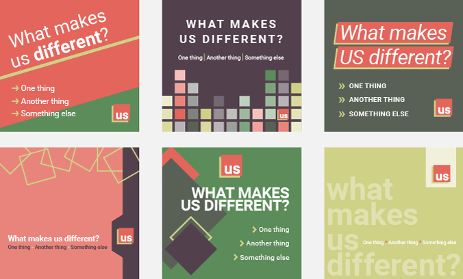
Six different ways to combine the same logo, type, colours and content.
Friday 26 February 2021
Six different ways to combine the same logo, type, colours and content.
I have previously written about what I mean by visual identity. I have also looked at the benefits of visual identity guidelines and why every business needs them. In this post, I want to dive a little deeper into what information it is helpful to include in these guidelines.
First, a note about terminology: I am referring to visual identity guidelines because I want to focus specifically on how your business presents itself visually. But there are many similar terms, which marketers and designers use almost interchangeably. Corporate identity guidelines, style guides and brand guidelines also include information about visual identity. But they may cover verbal identity, and possibly brand vision, values and so on, as well.
Your visual identity guidelines can be simple or complex to suit your needs. For simple guidelines, document your logo, colours and typefaces with information about using each element.
Once you have the basics, add information on any other elements that form a part of your visual identity. For example, you might use a graphic device such as a tab or dynamic line, distinctive heading styles, page grids, photographic or illustrative style.
Larger organizations with decentralized marketing and communications might also want to include information about setting up business stationery or PowerPoint presentations. They may also need to document sub-brands which use variants of their master logo.
The information you collate will feel self-evident to you. But it will be invaluable to someone who does not have the same level of familiarity with your branding as you do. And remember, you can always expand upon your guidelines in the future, so the first edition need not be exhaustive.
There are almost infinite ways to combine the core branding elements described below. The easiest way to help users understand what to aim for is to show examples of existing materials in each section of the guidelines. Make sure that some examples demonstrate how all the elements work together.
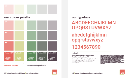
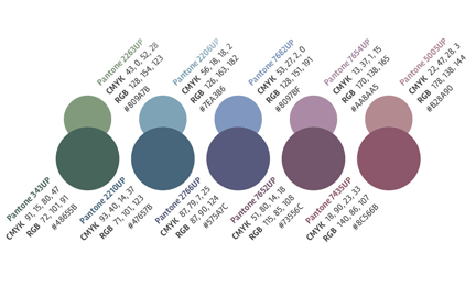
Show the colours in your brand palette, identifying core and secondary hues, if appropriate. Label each swatch with colour specifications; Pantone references and CMYK breakdowns for print and RGB or Hex codes for screen use. To find out about specifying colours see Learning your colours and Saving money with correct colour specifications.
If particular colours are reserved or prohibited for specific uses, then include this information in this section.
Sample each typeface you use and explain where, when and how it is appropriate to use it. For example, you may have one typeface for headings and one for body text. Or you may specify a different typeface for professional publications to internal word processing documents. You should also include licensing information – does your organization hold a site-wide or multi-seat licence, and how and where can users obtain copies of the typefaces and licences.
Include information about how to present text. You might include guidelines about words with specific capitalization requirements, text alignment, minimum type sizes, or minimum levels of contrast between text and the background.
Some style guides include detailed typographic guidelines about punctuation like en-dashes or the Oxford comma. An alternative option would be to choose a commercially available style manual, such as New Hart’s Rules – The Oxford Style Guide, and request that users follow these conventions.
Show your master logo on its own against a white background. If your logo uses colour, label each part in a way that allows cross-referencing with your brand palette.
If you have secondary versions of your logo, like single colour, mono, small size, or different lockup variations, then show each one individually and explain when, where and how it is acceptable to use it.
Logo size and placement is important too – should your logo always be in the top right corner of a page? How much space should be left clear around it? What is the minimum permitted size of each version? If you use a strapline, how large should it be compared with your logo and what relative position should it have?
Include information explaining how to get a high-quality copy of your logo to avoid users pulling low-quality versions from the internet, or recreating your logo themselves.
Do you use a particular style of image, or images presented in a specific way? Do you use photos or illustrations or both? Are images always full-page, desaturated, mono or high contrast? Provide as many examples as possible in this section – it will be simpler and more reliable than describing your requirements in words.
Document any graphic devices, patterns or icons that you use in this section. Include any rules about how and where users may use them and where they can find the graphics themselves.
The content of this section will depend entirely on your activities.
For example, the paper you use will affect the appearance of your printed publications. You should, therefore, include it in your guidelines. You might specify the finish it should have or if you want it to possess particular environmental credentials. You might even identify a specific range of paper.
Documenting your existing branding and the way you apply it is something that you can do yourself. Your guidelines don’t need to be fancy – just clear.
However, pulling together all the information for your guidelines is likely to identify any existing gaps or inconsistencies. You can iron out small inconsistencies in the way you apply your branding over time. If you have larger gaps or anomalies in your visual identity, or you find that your branding needs developing or extending, then I would recommend working with a professional designer to establish the best way forward before producing any more branded items.
Related posts
Why you need visual identity guidelines
29 January 2021
Saving money with correct colour specifications
30 August 2019
Learning your colours
15 January 2015
![]() Recent posts
Recent posts
![]() Featured posts
Featured posts

Briefing a designer

Eight reasons to use freelance creatives

Putting a freelance designer at the heart of your project

Hello! I’m Sarah, an independent typographic designer, helping businesses to communicate their unique selling points through printed marketing and communications.
I’ve been sharing my knowledge about design, typography, marketing, branding and printing since 2014. I hope you enjoy reading my blog.

Sarah Cowan